Quantcast
Channel: Deja View

MUSHKA Music Video

$
0
0

We made a music video featuring Richard Sherman's "Mushka's Lullaby". 

The wonderful Holly Sedillos is featured during her actual recording. The amazing Synchron Stage Orchestra Vienna is playing the music. 

Have a look:

https://www.youtube.com/watch?v=PAuegQPcmT0


The song was arranged by the great Fabrizio Mancinelli, who also provided the film's score.

Negotiations regarding MUSHKA's distribution have only just begun.


Long Lost Model Sheets

$
0
0


I just re-discovered these model sheets. Drawings and notes (with typos) were meant for my animation crew, animators as well as clean up artists. These sheets date back to July of 1996. 
The hand positions were inspired by Milt Kahl. I just stylized the fingers a little.

Such a long time ago, but as they say...it seems like yesterday.


It's just so satisfying to see that our film Hercules seems to have grown in popularity over the years. There is a terrific stage show in Hamburg/Germany right now (soon to be in London as well), and more and more students tell me how much they enjoy watching the movie today.

A previous post on Herc from 2013:

Elsie Henderson

$
0
0


Elsie Henderson was an English painter and sculptor who lived from 1880 - 1967. She was terrific depicting animals, particularly big cats. 
Since July 29 is World Tiger Day, here are a few sketches that showcase her excellent observation of these magnificent animals.


An Olympic Chanteuse

$
0
0

These days the world is talking about the return of Celine Dion. 
Ever since her song for Beauty & the Beast (with Peabo Bryson) I have been a fan of hers. 
In 2011 I had the great pleasure of meeting this superstar before her show in Las Vegas. Her musical program at that time included songs for movies, and I thought she might enjoy a sketch which puts her into the world of Titanic as well as Beauty and the Beast. I am happy to say Celine was thrilled.

In the end she suggested that we re-enact the staging in the drawing I brought. 

Her performance last week in Paris from the Eiffel Tower was one of the most breathtaking things I have ever seen.


Early Hercules

$
0
0


As mentioned in my previous Hercules post, I recently re-discovered early character designs which I thought had been lost. These marker drawings are less stylized than the final version, and Herc has longer hair. My thought here was that these curls would add follow through movement, and this sort of thing always loosens up your animation. But...he ended up with a haircut, because in all of those ancient Hercules statues the hair is pretty short.

After such a long time it's kind of funny to see how I started the character off. 


Jessica Rabbit Roughs

$
0
0

Russel Hall animated  most key scenes with Jessica. His take on the character is unique as you can see in these two spectacular rough drawings. Her sensual qualities could have been portrayed in a cliche, overly cartoony way. But Russel developed a brand new animation style, based on realism and American pin up. He was the perfect animator for this character. 

If you know Russel's work, you find that he was equally capable of handling broad exaggerated designs as well. 


Henn/Deja Sequences

$
0
0

Congratulations to Mark Henn for receiving the Disney Legend Award!

I worked with Mark on the same sequences from time to time. Here are a few of my favorites.


King Triton argues with his daughter Ariel.  I said this before, I was practically animating my own father when he gave my teenage sister Christa a hard time for returning back home late after an evening out. James Baxter also drew a few scenes here toward the end.


Jasmine confronts Jafar to find out what is going to happen with Aladdin. By this time Mark had relocated to the Disney/Orlando studio while I was working in Burbak. It might sound strange but we never felt the need to discuss things over the phone. Everything was laid out so clearly in the story sketches, it was obvious who would do his animation first and who would follow. 


Scar sets up Simba on a rock just before the wildebeest stampede. With such great voices to work with, it was almost easy to come up with interesting performances. Again, Mark animating in Orlando, I animated in Burbank. 


The Horned King

$
0
0

I have written plenty about The Black Cauldron over the years. This was my first project at Disney when I started there in August of 1980. The studio was finishing The Fox and the Hound, and I was asked to help design characters for the next feature film. At first it was just Tim Burton and myself, then Phil Nibbelink joined the the design unit. 
After a while management decided that Tim's style would not work for this film, and that a more conventional look was in order.
I came  up with the final design for The Horned King (as well as Creeper, his little henchman.)
But I did not animate any scenes with those characters. The problem was with the concept. The Horned King was just bad, that's it. In order to make your villain interesting though an only evil personality isn't enough. There need to be eccentricities, sarcasm, a weird sense of humor...or even intelligence. 
Later on for future projects we would craft more rounded villains that became interesting because their personalities were richer and unique. 
Ursula is the ultimate camp, Gaston is ridiculously vain and Scar really enjoys being cruel.

Actually this applies to any character in an animated film. In order to connect with an audience the main personalities have to be complex and multifaceted..like real people.


John Lounsbery's Robin Hood

$
0
0

I have written before about John Lounsbery's involvement in the character of Robin Hood. He started him off by animating a few scenes, before Milt Kahl took over Robin. 

Early designs by Ken Anderson showed Robin with a thin neck and long nose. Then Milt added a bigger neck for a spiffier appearance.

The first three drawings are Lounsbery's. They are available at:

https://www.animationartgallery.com/category-s/18702.htm


This is Milt's version of Robin from a scene in the film's opening sequence.


New Busch Originals

$
0
0

I am thrilled to add these two relatively small original drawings to my modest Wilhelm M Busch collection. Two centaurs, ball pen, and a circus backstage scene, pencil and color pencil.

Pure draughtmanship, a feast for the eyes.


King Triton Moments

$
0
0

These are various bits and pieces from scenes that show my first rough animation pass. After approval I redrew the animation in light blue and graphite for a more detailed version that would help clean up artists tie down their final drawings.

Probably animated late in 1988.


Cinderella's King and Duke

$
0
0

I am not sure who the actors are who provided live action reference scenes for the animators here. But I do know Milt Kahl animated this section of the film. 

When asked about working on the two characters Milt said that they weren't too much fun, but that they worked ok for the story. The earlier introductory scenes of the King and Duke were animated by a different animator, and at that time Milt felt compelled to re-draw all of those scenes in order to improve the poses and overall draughtsmanship.


Eric Larson, Post 1500

$
0
0


Today is Eric Larson's birthday. This is also post # 1500. I am re-posting the first blog image from June 6, 2011. The pic was taken by Hans Bacher (I believe in 1980) as I am paying attention to Eric's animation demonstration.


Eric is reviewing a pencil test on an old Moviola. From left yo right: Bill Frake, Kathy Zielinski and Matt O'Callaghan.


Eric with Lisa Davis, late 1950s. Lisa is the voice for Anita in 101 Dalmatians. 


A Frank Thomas Birthday

$
0
0


Yesterday was Frank Thomas' 112th birthday. His work and the films he worked on have become timeless masterpieces. When reflecting on his animation career Frank said that he always felt lucky to have been at the right place at the right time. Aptly called "The Laurence Olivier of Animation" he set himself very high standards when it came to creating a performance. Someone asked Frank once about now he felt about his accomplishments. He responded by pointing out that 2 or 3 scenes (out of all he had done) met his standards. He did not say which ones. 

People who worked with him said that he was impossible to please. There was always...always room for improvements. Disney was so lucky to have such an animator who helped elevate the art form. 

The first photo shows him in his office working on Miss Bianca for The Rescuers, around 1976.

In the next pic we see Frank at the premiere for the film in 1977 along with actress Eva Gabor, who voiced Miss Bianca. 


Frank at his home in 2001. 


Just a handful of drawings that show Frank's versatility, his love for the performance, his sense for appeal and many other things. Genius.!!!


Much more here in this early post from 2011:


Jungle Book Color Sketch

$
0
0

I believe Al Dempster painted both of these visuals for the Counsel Rock scene from the Jungle Book. First the color sketch, then the final background (with the characters cel overlay).

Both absolutely stunning!


More Heinrich Kley

$
0
0

I just discovered these two Kley drawings online. It is unusual to see his sequential work, or in this case  A, B illustrations. 

I suppose the first image might say: Come check this out! And the second one: Booo!

Great attitudes on the human figures as well as the the fantasy ocean characters.


Marc Davis Art

$
0
0

A few highlights from the recent Heritage Auction, featuring the art of Marc Davis. From gag drawings and personal notes to Picasso-esque art. This man expressed himself in a multitude of ways.

The sculpture of him was a gift from Imagineering to Marc upon his retirement.


Fritz Hug Animals

$
0
0

 This is not the first time I post beautiful animal drawings by Swiss artist Fritz Hug (1921 - 1989). Especially his loose, sketchy work is very inspiring to me. 


Many more images here at the new Fritz Hug website:

https://fritzhug-bildarchiv.ch/


A Maleficent Color Issue

$
0
0


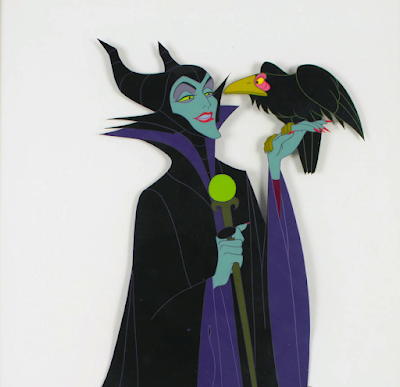
A beautiful color design for Sleeping Beauty's Maleficent by animator Marc Davis. You may notice that her main colors here are black and red. Marc told me that red to him represented fire, and he felt strongly that this should be her final appearance..
Art director Eyvind Earle had a slightly different color scheme in mind for this villainess. To him it was black and purple. And since Walt Disney had given Earle a lot of authority over Sleeping Beauty...purple it was.   
Many of us might think that working on classic Disney animated films was all fun and games, when in fact there were artistic disagreements all the time. 


Hercules Mall Tour

$
0
0

Back in 1997, I had the privilege to help kick off a Hercules Mega Mall Tour as a promotional effort for the release of the film. It was a lot of fun, and I remember flying to Atlanta, Georgia with Roy Disney in his private jet. How cool is that!?


The Disney Hercules Mega Mall Tour was a five-month promotional tour that began in February 1997 to promote the release of the 1997 Disney animated film Hercules. The tour included stops in 20 cities across North America and featured a variety of activities, including: 
  • Ani-Muse-Ment-Show: A multimedia performance with a live singing muse inspired by the five muses from the film 
  • Learn To Be an Animator: A 10-minute video workshop where kids could follow Andreas Deja, the animation supervisor for Hercules, through the animation process 
  • Hercules-themed games: Midway games and game booths 
  • Pegasus carousel: A carousel featuring Pegasus 
  • Drawing lessons: Lessons on how to draw Hercules 
  • Merchandise: A variety of Hercules merchandise for purchase 
  • Cassette giveaways: Mall patrons were given away cassettes of the song "Zero to Hero" 


The Rescuers by Ollie Johnston

$
0
0

To be honest with you, Bernard and Bianca aren't my favorite designs for Disney mice, but when Ollie Johnston draws them...how can you not love these characters?!

Just like his mentor Fred Moore, Ollie's work has always such appeal. These are big drawings on 16 field paper. They had to be part of a pose test, because there is no way drawing #7 can follow #6 without any inbetweens. 

So much emotion in these sketches! His words of wisdom to us young animators was:

"Don't put drawings on paper, put feelings on paper!"

In retrospect, that was the best animation advice I had ever gotten.


Disney in 1949

$
0
0

These are pages from a booklet that show what kind of character merchandise Walt Disney Productions was offering in 1949. As you know revenues from these products were essential in keeping the company afloat, particularly during the "lean" 1940s. The early 40s presented a very tough time because only Dumbo was profitable (and not by a lot). 

It is mind boggling to realize that Pinocchio, Bambi and Fantasia all flopped when first released.

I enjoy studying the quality control over these items. Most of them look actually very nice. There is a vitality and a sense of joy to them.

There are a lot of pages, so here goes:


O'Malley in Stripes

$
0
0


I posted this image of Milt Kahl drawings before. Here is Thomas O'Malley, the alley cat from The Aristocats, drawn with stripes. It is hard to imagine that during a time of tight budgets at Disney (post Walt), the studio was even considering adding this pattern on to the character. It would have taken longer and it would have been expensive to bring O'Malley to the screen.

Here are a couple of realistic "cat with stripes" sheets. They come from the estate of Ollie Johnston, though I am not sure if Ollie drew these. He might have, because Ollie ended up animating a lot of scenes with O'Malley...without the stripes.


Villains

$
0
0

I suppose I should have posted this image for Halloween. I drew this sketch while I was working at Disney's Orlando Studio, quite a few years ago. It is a rough layout for an illustration I never finished. Perhaps I can use it as the cover for my autobiography.....


More Marc Davis Art

$
0
0

A few stunning pieces by Marc Davis currently offered at Heritage Auctions. Mid Century American Modern at its best. (Or as Richard Williams called them: California Picassos).