Quantcast
Channel: Deja View
Viewing all 1314 articles
Browse latest View live

Peter Pan Key Drawings

$
0
0

Nice publicity photo of Walt Disney and young actor Bobby Driscoll on the stage set, where live action footage was filmed to aid the animators in their work. Milt Kahl was the supervising animator for Peter, and he generally ignored the live action reference when animating the character. He felt strongly that an animator, who is worth anything in the industry, should know how things (humans and animals) move. I can detect a handful of Milt's scenes where he based his animation somewhat on Bobby Driscoll's live performance. When Peter Pan angrily confronts the Lost Boys for shooting down Wendy out of the sky, his acting is emotional and graphically clear. Those scenes still show traces of a live actor's motions, but they don't stick out compared to the animation that came from Milt's imagination.
The drawings below are from one of those scenes. Inside Scull Rock Peter Pan slides down a boulder, positioning himself before impersonating Captain Hook. These few keys demonstrate basic animation principles in a way that live action probably wouldn't. As Pan moves downward, his arms and feet point upward to counter the action. When he arrives at the the low point, the arms come down, and his legs swing upward because of the motion's momentum.
A cartoony piece of animation, thoroughly analyzed and realistically drawn with ultimate appeal.
Drawings like these are extremely useful to everyone who studies anatomy in motion.

#2

#5

#7

#10

#12


Design sketches from this earlier post show how Milt modeled Peter Pan after Bobby Driscoll's appearance:
http://andreasdeja.blogspot.com/2011/08/peter-pan.html


From Thumper to Shere Khan

$
0
0

Milt Kahl is showing off model sheets of Bagheera from TheJungle Book to colleague Eric Larson, who seems somewhat less excited than Milt. During the 1960s practically all Disney model sheets were comprised of Milt's rough animation drawings. No turn-around sheets, no character maquettes, just Milt's animation drawings from his first production scenes. Director Woolie Reitherman realized that nobody drew and designed new Disney characters better than Milt Kahl. Milt's drawings were the final word, the standard all other animators looked up to. Their goal was to come as close as possible to these sophisticated designs graphically, but still insert their own approach to the characters  as far as acting and performing.
I want to show a high in Milt's career from the golden age of Disney animation to a later high, just before his boss passed away. Both drawing styles are astonishingly beautiful, one round and dimensional, the other graphic and sophisticated. It is so interesting to me that neither Milt, Frank and Ollie, or other animators recognized these two different styles within Disney Animation. I remember asking Eric Larson about the change in approaching Disney drawing, and he just mentioned that the animators drew what was required of them. To Eric there didn't seem to be new approach at all, you drew the characters a certain way in order to get the best results.

Milt's rough animation drawings from Thumper's famous scene: "If you can't say something nice..."


Key drawings from Milt's first few scenes with Shere Khan.


Alice and the Caterpillar

$
0
0

When Alice meets the eccentric Caterpillar she realizes that she is not in London anymore.
Like most scenes from the film, this encounter was filmed in live action as an aid to the animators.
Kathryn Beaumont acted out these moments beautifully, and Milt Kahl started animation on the title character of the film for this sequence. (Reflecting on his work years later, Milt thought he came up with a cute Alice here, but that some other animators fell short of producing quality footage with the girl.)
I am not particularly fond of the Caterpillar's design, I think that several book illustrators came up with more intriguing concepts for this character, like this illustration by Harry Rountree:


Backgrounds and cels don't match in these images, but they provide a glimpse into the astonishing stylized art direction of the movie.


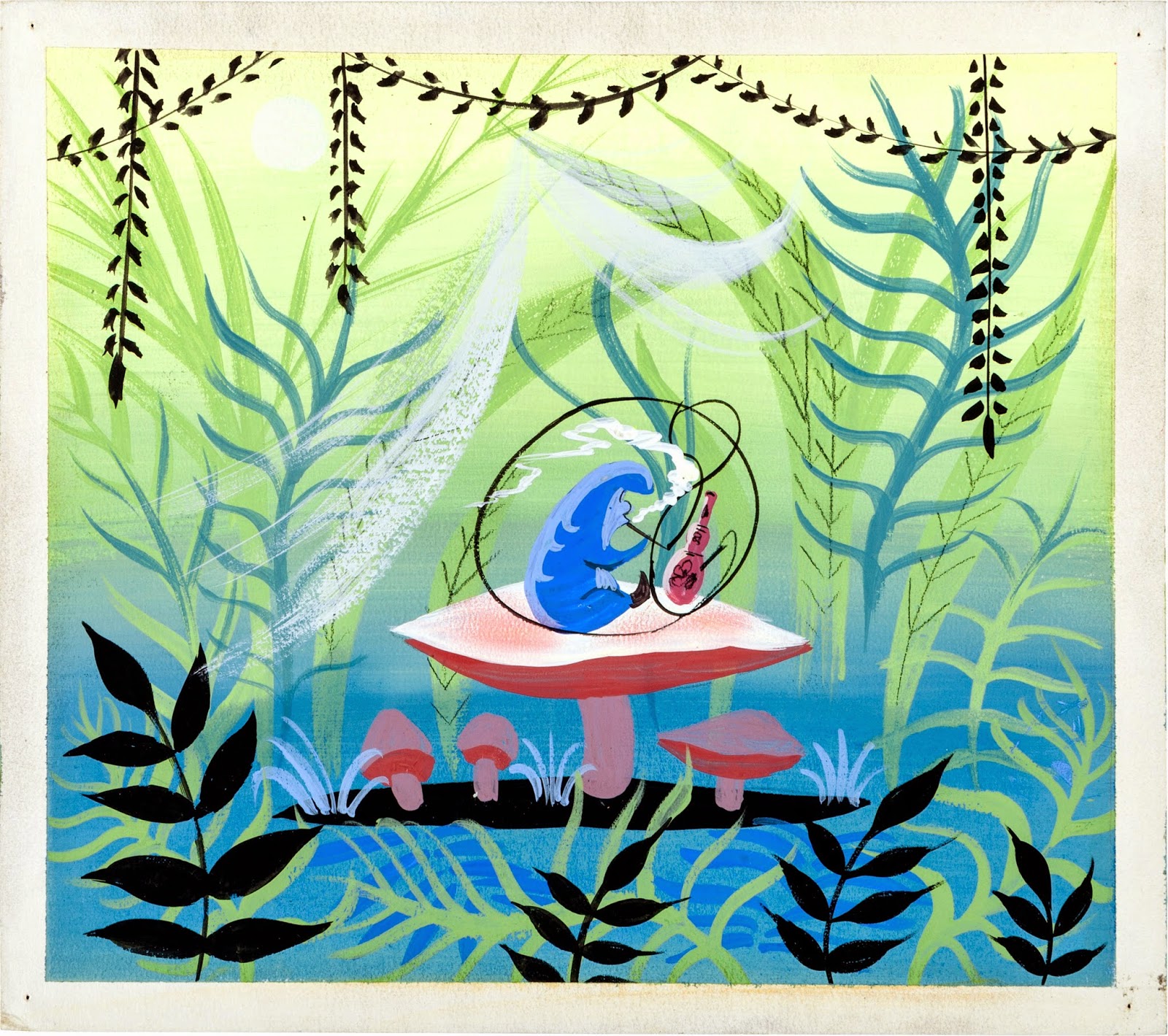
A couple of many beautiful color sketches Mary Blair produced for this sequence.


Images Disney/Heritage Auctions

Pongo

$
0
0

Australian actor Rod Taylor died a few days ago in Los Angeles. I have always enjoyed his roles in films like The Time Machine and The Birds. For Disney he provided the voice of Pongo in the iconic 101 Dalmatians, with a wonderful and understated performance. I don't know if  any other actors were considered for the role, but Taylor turned out to be perfect.


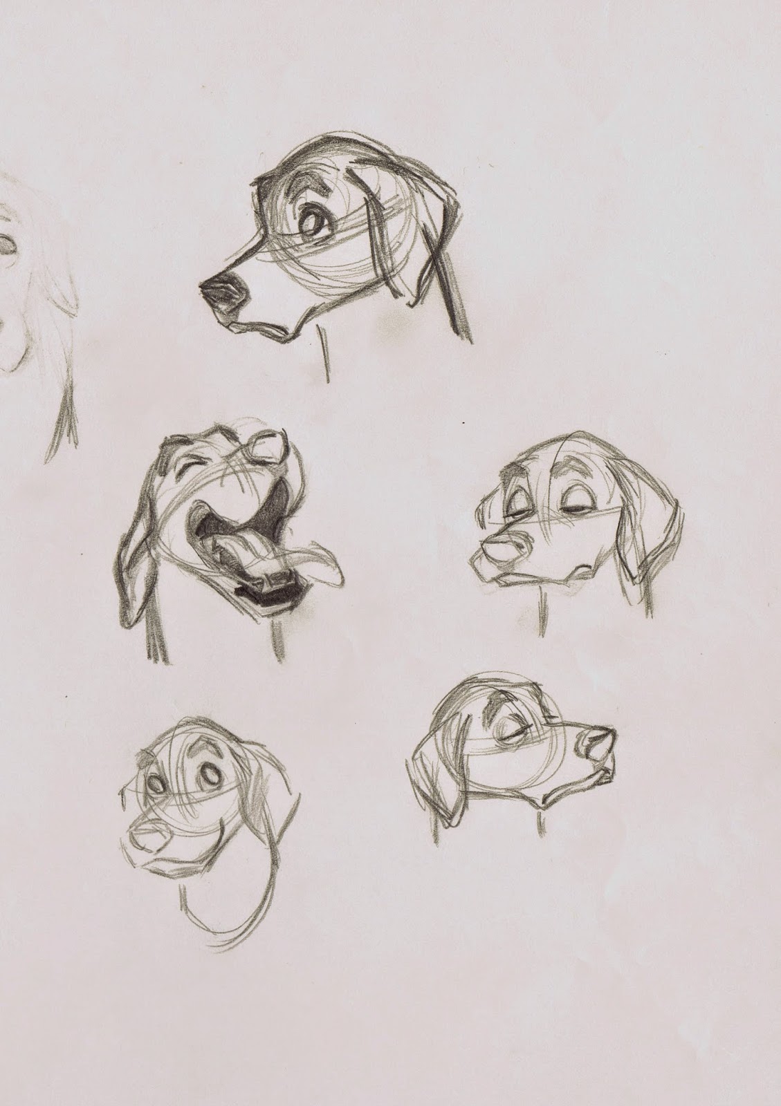
A few of Milt Kahl's many facial studies, based on the appearance of life Dalmatians, brought into the studio for observation.
For more Pongo life drawings by Milt, Marc Davis as well as Frank and Ollie, go to this earlier post:
http://andreasdeja.blogspot.com/2012/01/dalmatians.html


It is interesting to see how Milt tried early on to incorporate the dark edges of a Dalmatian's mouth into the design, an idea that was eventually dropped.


A beautiful sheet showing Pongo holding Roger Radclliff's hat. Masterful sketches, and it's nice to see that even Milt occasionally corrected himself, like re-positioning the dog's left front foot.


Another type of design, with a larger muzzle and a very small pelvis area. The size of Pongo's muzzle became the subject of debate between Milt and story man Bill Peet. You can read about it here:
http://andreasdeja.blogspot.com/2012/01/pongo-muzzle-issue.html


The corrected and final version of this pose ended up in the film and on the model sheet. Perfect proportions and appeal!


Ollie Johnston animated the melancholic sequence with Pongo as he tries to comfort Perdita, who is hiding under a stove. The first drawing is an Ollie rough, followed by a Milt drawing, as he clarifies forms and shapes without loosing the sentiment of the moment.


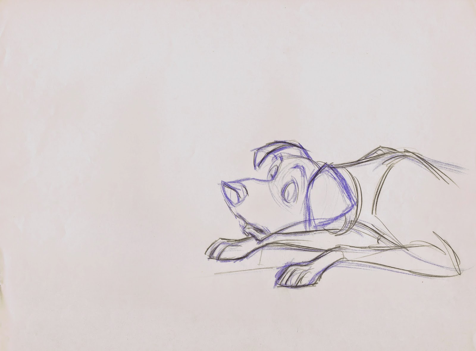
Here are a couple exploratory drawings from one of my all time favorite scenes. The rough above is a  discarded animation drawing, probably rescued from Milt's trash bin by an assistant.
Milt goes very, very far here as far as graphic representation of this scene. Razorsharp points and an intense balance of straight against curved lines make Pongo look like a Picasso creation. Yet anatomical correctness is never compromised. Even if some people don't appreciate such a stylized approach to Disney drawing, they buy into it because of the scene's weight and  fluidity of motion.
Not to mention the overall convincing emotions a dog goes through when scratching, yawning and collapsing on to a pillow. 
Just a few years earlier Milt had animated a similar scene with Tramp, as he wakes up inside a barrel near the train tracks. It was in Milt's nature to constantly challenge himself and try different ways to handle a situation that was somewhat familiar to him.
Animated sometime in 1960, even after so many decades this remains a MODERN animated masterpiece.


A gorgeous drawing showing Pongo examining the cover of one of Roger's magazines. I love Milt's scribbly version of a pin up pose. Thanks to my friend Wil for offering a scan of this sketch.


So here's to Walt Disney's 101 Dalmatians and the main character's voice actor Rod Taylor, who's charismatic performance in this animated film as well as in other movies enriched many people's lives.


Disney Mix

$
0
0

Running a bit short on time these days, trying to finish the animatic (story reel) for my film Mushka. Almost there !
Here are a variety of images from different stages of Disney Productions.

The design and the animation of Disney classic characters blossomed during the late 1930s and early 1940s. I am still nuts about the appeal, the daring poses and the staging. Look how Donald is holding his artist palate, incredible! And Minnie...


Once flat graphic design was applied to these characters, they lost some of their charm.


Fine Art!!!


Some of Albert Hurter's brilliant character design explorations.


One of the oddest Disney short films.


Pecos Bill, crazy story, brilliantly animated by Milt and Kimball.


The one and only!!


Ken Anderson charm.


I had a poster of this Jungle Book grouping on the wall of my room when I was a kid. It sums up my childhood.


Fox Hunt and Horse Race

$
0
0

The huntsman blows his horn, and the pursuit begins for that scrawny, little fox in Disney's 1964 film Mary Poppins. Milt Kahl animated key scenes for the fox hunt, he also came up with the final designs for the horses, riders and the fox. Brilliant character research, influenced by illustrator Ronald Searle.


John Lounsbery animated the following two scenes beautifully, maintaining the design sensibilities  in these Milt sketches.  The final scene shows the horse with a monocle, just like the rider. The idea goes back to the opening sequence from 101 Dalmatians, where dogs and their owners share a definite resemblance.


An original, but discarded ruff from one of Milt's scenes featuring the nervous, but spunky little fox.
For more on this character go here:
http://andreasdeja.blogspot.com/2011/07/mary-poppins-fox.html


The welcoming committee at the races consists of a beautiful variety of stuffy seniors. A Milt Kahl scene done very effectively with limited animation.


Thanks again to my friend Will for offering scans of drawings from his collection!

Marc Davis Sketch

$
0
0

I need to ask Alice Davis about the title and date of this beautiful color sketch. An amazing graphic composition emphasizing straight against curved lines. Look at the fluid movement of the python contrasting the bold straight lines of the giraffe's neck. There is no doubt in my mind that if Marc didn't have careers in animation and imagineering his contributions to American illustration and art would have made him a world renowned fine artist of the 20th century.

Get the book Marc Davis, Walt Disney's Renaissance Man:

Mim as a Dragon

$
0
0

The animators who worked on The Sword in the Stone all agreed that The Wizard's Duel was a highlight of the film. This is pure character animation material, two sorcerers turning themselves into a variety of animals in an attempt to crush the opponent. This story sketch showing Madame Mim as a dragon (a rule breaker) is by Bill Peet, who not only boarded this sequence, but the entire film.
Milt Kahl pretty much kept Peet's design intact while polishing it for the dragon's final appearance.
Milt basically redrew poses from Peet's story boards, making only minor adjustments so the character would fit into the overall styling of the movie.
Milt himself didn't animate any footage with the Mim/Dragon, Eric Larson ended up drawing those scenes.
Here is Milt's very graphic version.


You can find much more on the Wizard's Duel in this earlier post:
http://andreasdeja.blogspot.com/2012/05/wizards-duel.html


Disney Ladies

$
0
0

Disney female characters are among the most difficult to animate, depending on the degree of realism in their portrayal. Look at this clean up drawing of Cinderella, which was drawn right over Marc Davis' rough drawing. Simplicity, elegance and appeal. Her face is perfectly depicted, if you are off by the width of a pencil line, this character would look like an alien from outer space. All facial features need to be drawn within perfect proportions without looking technical or cold. I don't think draughtsmanship like this exists today (which is not necessarily a bad thing), this was the art of that particular generation.

Years earlier, before Disney got into animated features, the 1934 short film The Goddess of Spring tried to portray a fairy character with realism. The result did not please Walt Disney.


By the time Snow White went into production, Walt knew that live action reference was necessary to convincingly bring the title character to life. And only top draughtsmen were assigned to her animation and clean up drawings. Marc Davis created these delicate clean ups over animator Grim Natwick's rough animation. The scene shows Snow White reacting to the Witches sudden appearance by the kitchen window. 


The film's Evil Queen, animated by Art Babbit, demanded the same thorough and accurate draughtsmanship. Every pencil or ink line needed to define the character's subtle forms perfectly.


A rare rough animation drawing of Pinocchio's Blue Fairy, who represents American female beauty from the 1930s and 1940s. Gorgeous!


Les Clark drew some of the nature fairies for Fantasia's Nutcracker sequence. Not easy to portray a nude character with such innocent charm. This section, though mostly effects animation, ranks among my all time favorite moments in Disney Animation.


Fred Moore created the look for many Disney girls during the 1940s and early 1950s.
A beautiful rhythmic key drawing from the short Casey Bats Again, a charming character doodle of a skinny young girl and a model sheet from All the Cats Join in, another favorite of mine.


Walt Disney stated once that he was amazed to see the quality of draughtsmanship on a cel, which was traced from a clean up drawing that was traced from a rough animation drawing.
With each tracing and re-drawing some loss of drawing quality is bound to happen. But when you have a super dedicated staff, that loss is minimal.
These two cels from the film Cinderella are proof that the studio's process allowed brilliantly drawn characters to make it to the screen. 
Again, Cinderella's face looks beautiful, even after having been re-drawn several times.


Iwao Takamoto's super precise clean up studies over Marc Davis' animation. At this point Disney's graphic portrayal of a female heroine reached a level of sophistication never seen before. The stuff takes my breath away.


Marc Davis sketched Maleficent, before turning the image into a color design drawing.
Though theatrical, flamboyant and dramatic this character still required realistic handling in order to come across convincingly. One of the greatest Character designs in Disney history.


Marc's next villainess also ranks among the greatest in Disney history. Cruella De Vil is ugly, but you just can't take your eyes off her. She might be Disney's gutsiest design ever. Sometimes I wonder why Walt didn't stop Marc and asked him to tone her down. I am VERY glad he never did. 
Watching Cruella on the screen makes me almost giddy, and happy to be a part of this fantastic medium.


Madame Medusa is Milt Kahl's swan song before he left Disney. The story material was not as outstanding as Cruella's, but in many ways Milt outdid himself as an artist and thought outside of the box. The make up removal sequence alone is animation history. 
Cruella and Medusa are caricatured villainesses, but their drawing base is still realism. They move with real weight, hand gestures are impeccable and every head angle is convincing as well as  intriguing. 


Images Disney/Heritage Auctions

Who All Created Shere Khan?

$
0
0

We all know that the villainous tiger in Disney's The Jungle Book is a Milt Kahl character, but you'd be surprised to find out how many artists had a hand in creating this iconic bad cat.
Milt himself stated at one time that he really can't claim full ownership of a character he animated, because of other people's involvement in shaping its personality. He said, you've got the voice, which is so important, the story work as well as input by the director and other artists.
Milt felt like that by the time he gets his hands on the character, his contribution might be relatively minor.
Well...that's being overly modest, Milt never made any "minor" contributions to any of his animated characters.
Let's take a look at Disney artists who were involved in Shere Khan's development.

Story man Bill Peet doodled these poses, shown above, on a writing pad. Great drawings, but no specific character type is emerging yet. Peet left the studio early on in production of the film, his overall vision of Jungle Book clashed with what Walt had in mind.

Ken Anderson produced a ton of sketches as he explored the film's villain. This drawing still lacked menace, too comical.


I believe the following story sketches are Ken's work as well. By now he shows a tiger, who is confident, arrogant and above it all.


Go here to see story artist Vance Gerry's work on this sequence, and how it compares to Milt's final staging:

A publicity photo of actor George Sanders, who provided the tiger's voice, next to his animated alter ego.


A model sheet made up of Milt's magnificent animation drawings. Draughtsmanship and performance for the ages.


More on Shere Khan here:

and here:

Wilhelm Kuhnert

$
0
0


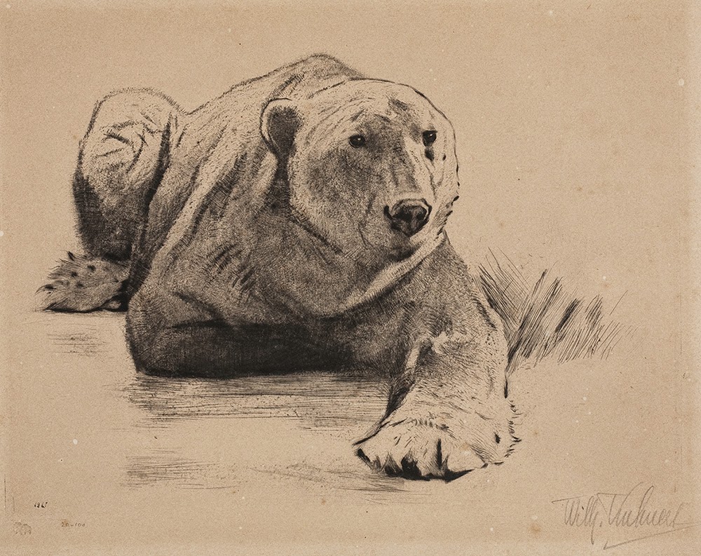
German animal artist Wilhelm Kuhnert (1865 - 1926) is somebody who's work seems to get better the more you study him. At first glance his drawings and paintings communicate the kind of bland realism that is so typical for a number of modern wildlife artists. But then dramatic, non formulaic poses of big cats and other wildlife emerge, showcasing the artist's unique observation. Unlike some other artists of his time, who studied animals at zoos, Kuhnert actually travelled to Africa, India and other places to see lions, tigers and elephants up close.
For obvious reasons I am very interested in his depiction of big cats. Wether resting, stalking or hunting, Kuhnert always finds the most intriguing poses to portray the animal's emotional state. By contrast his environments often don't come up to the quality of his painted animals.
See what you think!


Disney Book Illustrations

$
0
0

As a kid I was always searching for new Disney books which told stories using original stills from the movie. Looking at those film stills it felt like the movie stopped, and I had the chance to study the images thoroughly. Background paintings, inked or xeroxed cels and the overall color mood.
Then I discovered the Disney Golden Books. The pages in them showed special illustrations, in which the staging was often re-arranged to tell the story in a comprehensive way. Veteran studio background artists like Al Dempster, Gustaf Tenggren and even Mary Blair created beautiful paintings in Gauche or Watercolor.
Disney Editions recently published The Art of Disney Golden Books by Charles Solomon. It has great insight into the history of this popular book series. The art work is brilliantly reproduced, and each illustrator is profiled. I highly recommend this book:

http://www.amazon.com/Disney-Golden-Books-Editions-Deluxe/dp/142316380X/ref=sr_1_2?s=books&ie=UTF8&qid=1422510234&sr=1-2&keywords=disney+golden+books


Sherlock Holmes & Dr. Watson

$
0
0

Way back my art school (Folkwang Schule, Essen, Germany) didn't offer any animation classes. As a student I decided to give myself various assignments in order to explore my potential as a future animation artist. I would create model sheets a la Disney, animate walk cycles and try to explore character concepts for an imaginary movie project.
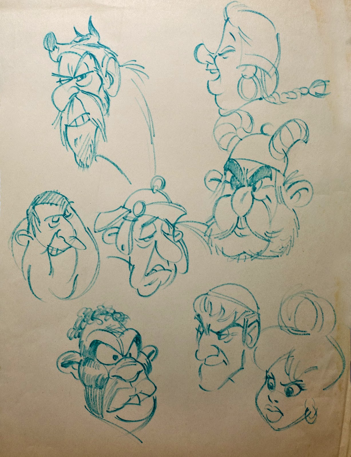
Early in 1980 (still at art school) I wondered what the cast of Sherlock Holmes might look like, if depicted as animal characters, similar to Disney's Robin Hood. 
It was a way for me to practice the Disney style in rough form (I had just found out that Disney designers and animators worked pretty loosely). So I practiced staging, expressions and a little bit of color exploration with Magic Markers. I never showed these sketches to my art teachers at school, knowing how much they disliked the Disney approach to animation. The one person I did show them to was my friend Hans Bacher, who had graduated from the same art school and was at that time in business as a designer, storyboard artist and animator for several German agencies and TV stations.
Without Hans' constructive criticism and input I would have been completely lost.

So here I figured Sherlock Holmes as some kind of bloodhound, Dr. Watson as a duck, the inspector as a fox, and a policeman as a lion.
When I look as these sketches now after so many years, I still sense my unstoppable passion for Walt Disney's Animation, so many years ago. (A passion that is even stronger today).


The Huntsman

$
0
0

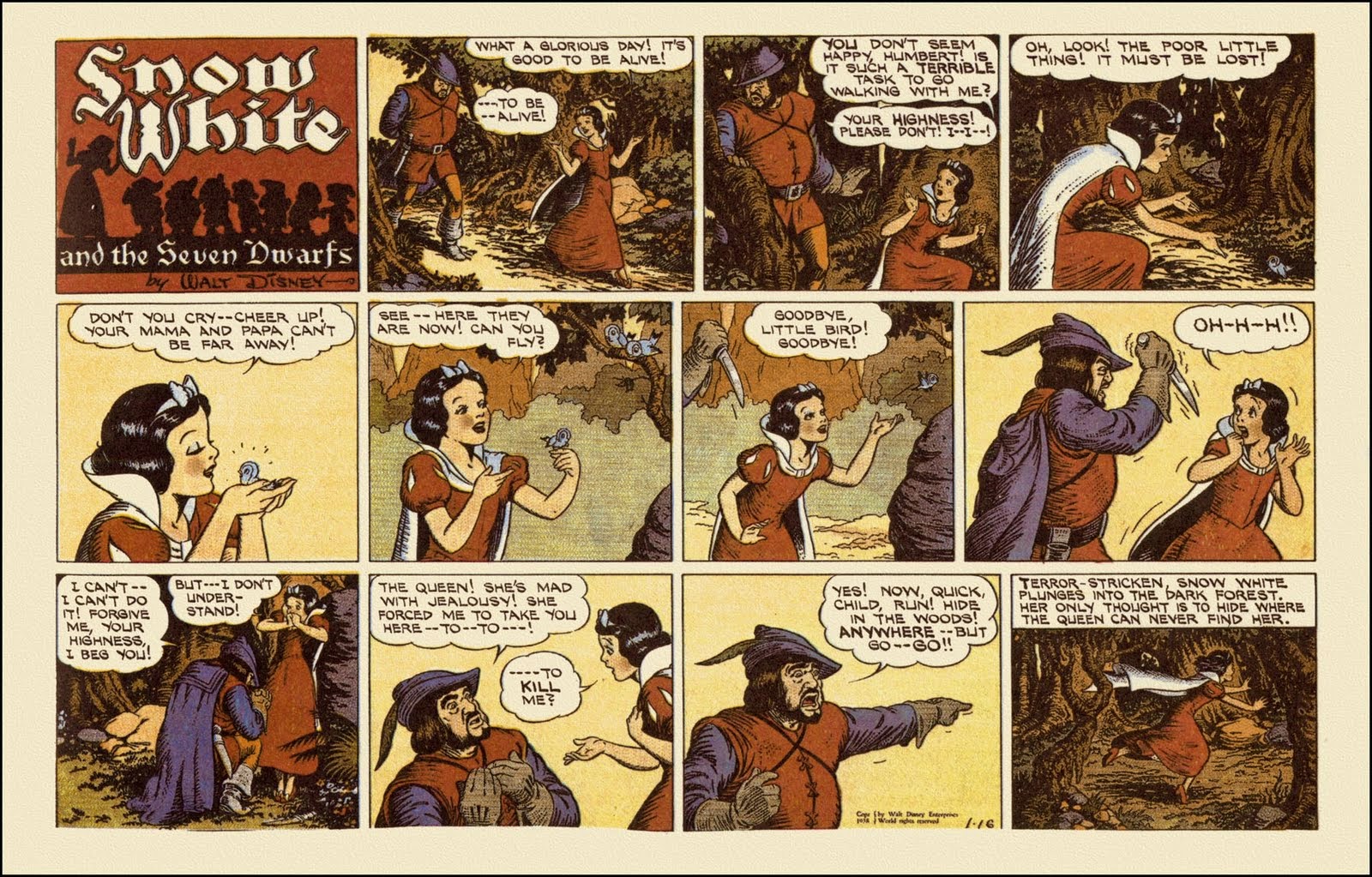
Albert Hurter drew these charming sketches showing the Hunter after he couldn't bring himself to kill Snow White. He begs her to run far away and hide.
That makes him a good guy, who disobeys the Evil Queen's orders. During the sequence preceding this moment though he is portrayed as a killer who will go through with murdering the princess.
With his scary expression and body movements everyone who sees the film for the first time believes he is going to do it.
To achieve this kind of horrific depiction some live action reference was used to help with the realism required for this type of character.


An actual photostat with the corresponding animation drawing, which is likely a clean up study, since it is drawn in red and not in black pencil.


It's astonishing to me how far Disney went with the portrayal of villains from the early features.
The Queen, the Witch, even the Spirit of the Magic Mirror must have scared the popcorn out of kids way back. But Disney insisted on strong contrast between good versus evil, and that needed to be clear in the characters' design as well as their acting.


Even the 1938 comic strip based on the film maintained the frightening anxiety of the moment.


Stuff I Drew in Art School

$
0
0

Here is another post with old student samples, ranging back from 1976 to 1979.
That's my landlord's son Rene in the drawing. He would stop by my rented room once in a while with friends. They sometimes watched cartoons while I sketched them.

A couple of life drawings. My art teacher encouraged us not to get used to our favorite tool. So I tried marker, pencil, brush and ink and even finger paint. It's always interesting to see what happens when you experiment.


A rough self portrait. A little too rough.


Studying anatomy and rhythm in old masters' paintings.


And then having the audacity to apply that to a cartoon girl.


Occasionally me and my student friends would get together and pose for each other. The models at school seldom got into poses that showed any motion.


More of Rene and his friends.


These are drawn from Super-8 film footage I took of dogs in action. Trying to get a feeling for anatomy in motion.


Playing around with poses for cartoon animals, anthropomorphic or otherwise.


An exercise in shape and line. After a few rough doodles I choose one composition to create flat graphics. I had just visited CalArts and assignments like these were exhibited on the school's classroom walls. So I thought I'd give it a try.


Studying the great Uderzo, of Asterix fame and other iconic comic strips. What an artist! Meeting him years later was un indescribable thrill.


Dabbling in semi abstract forms. Look at my signature on the bottom right, LOL. Any similarity to an American Animation producer is coincidental.


Looking back, I had a great time as an art student. There were two things that turned out to be essential to my future career:
Giving myself assignments that related to the art of animation, and having Hans Bacher as my "after hours mentor".
Here is more of my student work from a previous post:
http://andreasdeja.blogspot.com/2012/01/post-100-old-portfolio-stuff.html


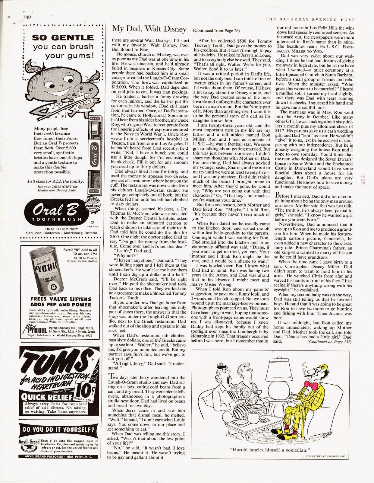
My Dad, Walt Disney

$
0
0

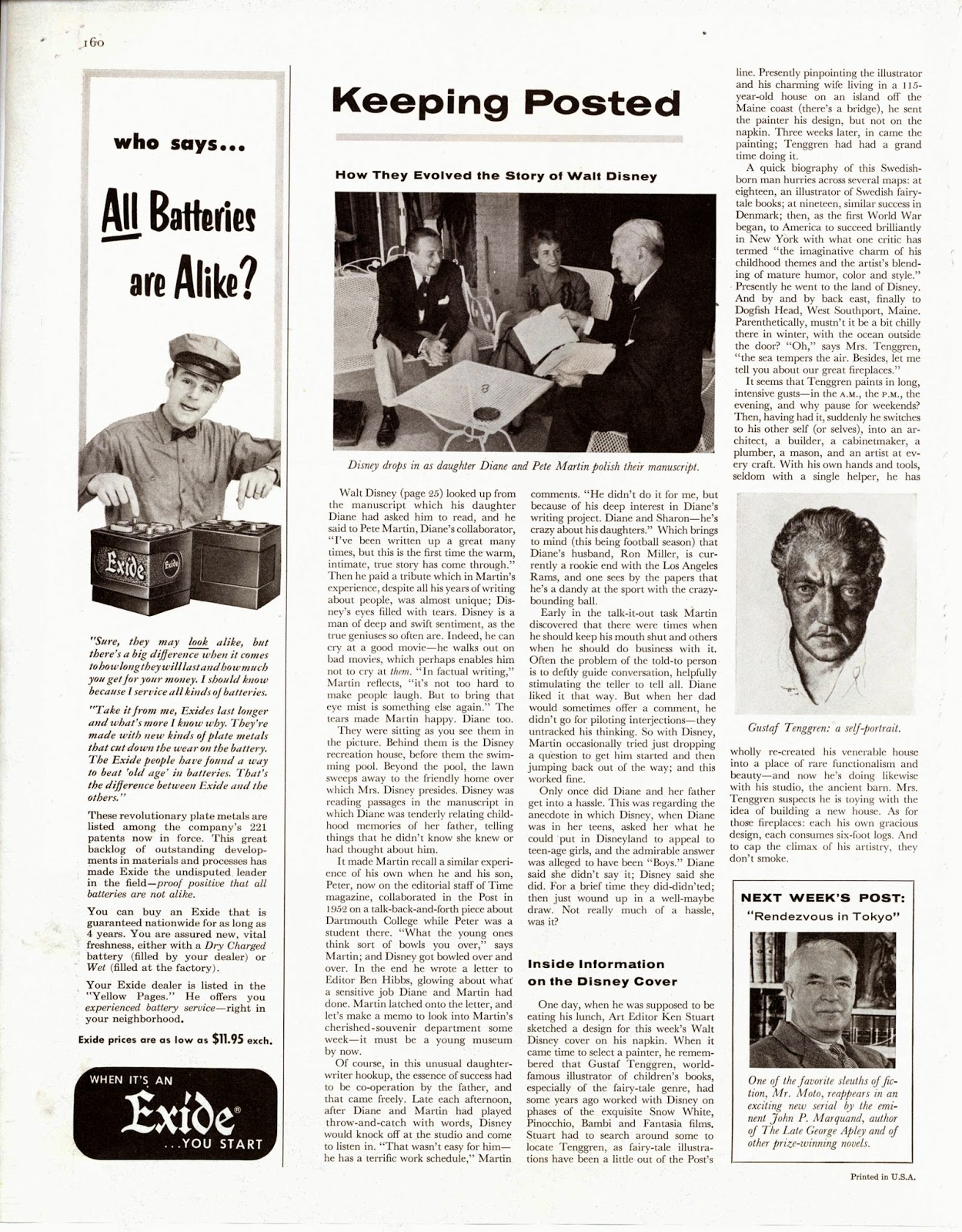
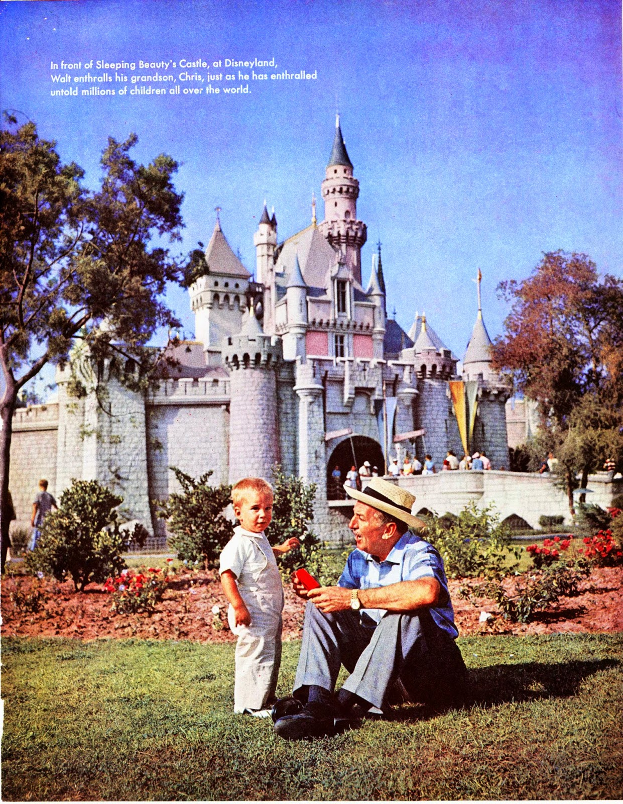
Bits and pieces of this 1956 series of articles from the Saturday Evening Post have surfaced online, but since I have scans of all of them, I thought you might enjoy the whole lot (posted in increments). In the mid 1950s journalist Pete Martin interviewed Walt about his life and career. This resulted in a book, in which his daughter Diane talks about her famous dad.
I have had the chance to listen to the entire interview, and even though Pete Martin (who seems somewhat intimidated by Walt) asks the questions, Diane is present the whole time, giving input.
Walt's grandchildren Joanna and Christopher are pictured throughout the articles, and today they are "old" enough to remember their Grandfather. I have had the pleasure of speaking to them just recently. As much as the Disney family prefers to be private, they are very much engaged in their mother's mission to portray the life of Walt Disney sincerely and properly.
Here is the first installment of Diane's and her dad's reflection on how it all began.


Walt Disney and Benny Goodman

$
0
0

One of the best postwar Disney shorts in my opinion is All The Cats Join In from the 1946 feature Make Mine Music. It is only four minutes long, but highly enjoyable because of Goodman's energetic music and fantastic animation by Fred Moore, Milt Kahl and others. Each time I watch this short, it puts me in a good mood.


A couple of Moore model sheets with loose, but solid and appealing drawings.


I am not sure who story sketched the film, but these drawings presented terrific inspiration for the animators.


The one thing that doesn't quite work for me are close up scenes, where the characters' black dot eyes look somewhat unsettling.


A design concept for the film's poster.


Eric Larson on Lady & Tramp

$
0
0

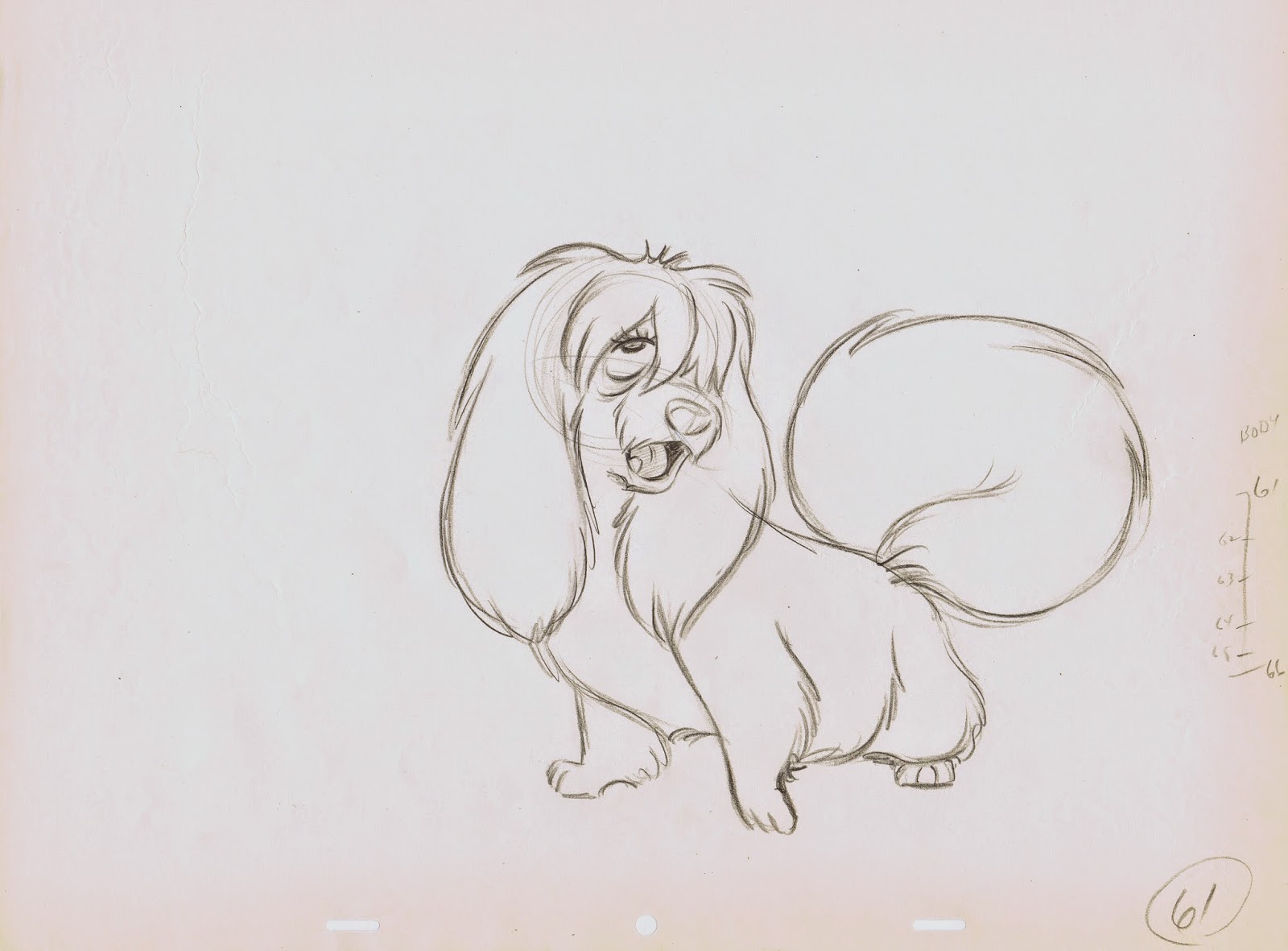
Eric Larson is flipping a scene with his character Peg for singer/songwriter Peggy Lee, who provided the voice for this sultry canine.
Eric usually downplayed his capabilities as a draughtsman when compared to animators like Kahl, Davis or Frank and Ollie. But his assignments for the film Lady and the Tramp show clearly that he was not only a great actor with a pencil, but that his drawings were right on par with the studio's high standards. Peg's animation during her song "He's a Tramp" is beautifully timed in its rhythm and elegant moves.
These rough animation drawings are loaded with appeal and flair.


The Beaver's footage was shared between Milt Kahl and Eric, and their scenes work seamlessly together. In the drawings below the Beaver tries to figure out a way to put on the dog muzzle, or as he calls it "a log puller". He is struggling to find a way how to put this thing on, and you can see that Eric struggles a little to work out the involved action. But it's a beautiful struggle, and in the end the drawings show great clarity in the scene's staging. A lesser animator would get all caught up in trying to figure out the technicalities of this piece of action. What beautiful drawings and what a beautiful scene.


Ken O'Brien

$
0
0

...is pictured second from the left in this group photo from 1965 showing Disney's top artists at WED (Imagineering). The more I find out about O'Brien's work the more I tip my hat to this artist. He worked on many Disney classics starting with Pinocchio all the way to Sleeping Beauty.
Great animator with draughtsmanship that is rooted in the rhythmic and charming drawings of Fred Moore.
Here are a couple of photo stats of Jim Dear from the production of Lady & Tramp, followed by Ken O'Brien's interpretations of the poses pictured.


O'Brien died in 1990 at age 74, I wished I had made the effort to meet him way back. 
If anybody knew him, feel to tell us about him and leave a comment.

A previous post featuring a couple of his drawings of Tiger Lily:

And this post includes a great group sketch from Lady & Tramp:

Joe

$
0
0

I LOVE this drawing!
The way the pose is balanced, the feeling for fabric like the stiff apron and the soft chef's hat.
Guess what? This drawing does not appear in the movie Lady & Tramp. Animator John Lounsbery reworked the part where Joe lifts a sizable chunk of spaghetti with meatballs from a pot and slams it on to a plate.
The final film version shows him looking already at the plate during this part of the action. Who knows wether Lounsbery decided to make this change, he might have been asked by the director or Walt himself to alter the animation during a sweatbox session.
So much life and energy in the drawing, the sort of feeling you can only get from pencil animation.

I think I am going to frame this one.

For more on Joe and his buddy Tony, go here:
http://andreasdeja.blogspot.com/2013/10/tony-and-joe.html

Viewing all 1314 articles
Browse latest View live