Quantcast
Channel: Deja View
Viewing all 1326 articles
Browse latest View live

Tiger Lily

$
0
0

Tiger Lily is a unique character in the Disney film Peter Pan.
Just like Tinker Bell she doesn't have any dialogue in the movie, but her emotions and attitudes are always clear. She is one courageous young lady. By resisting Captain Hook and not telling him about Peter Pan's hiding-place, she risks her life.
Milt Kahl came up with the final design for the character. He did the drawing above for Ken O'Brien, the animator responsible for most of Tiger Lily's scenes.

These model sheet drawings were done by James P. Miller during the early 1940ies, when Peter Pan was in early pre-production. Actually the final design doesn't differ that much from Miller's beautiful concept.


A couple of stunning animation roughs by Ken O'Brien, who is one of those unsung animation heroes. 
This spirited Tiger Lily dance alone makes him a top animator, and his work over the years deserves further investigating.


A frame from the film shows Tiger Lily next to her father, the Indian Chief, and Peter Pan.


The Evolution of Jafar

$
0
0


I was thrilled when I got the assignment to supervise the animation of Jafar, the villain in the film Aladdin. I had just finished work on Gaston, who had to be handled with a certain amount of realism.
I remember thinking: Not with Jafar!
Here was a chance to design and animate a character who belonged in a graphically stylized world.
Animator Eric Goldberg had already done some incredible test animation of the Genie, which helped to set the style for character designs. Inspired by the fluid lines of famous caricaturist Al Hirschfeld combined with the voice of Robin Williams, Eric created a Genie for the ages and set the bar very high for the rest of us.
But how would I handle Jafar's personality against the uber entertaining Genie and the rest of the cast? Should I go along and give him plenty of lively gestures or should I downplay his acting and look for contrast instead?  
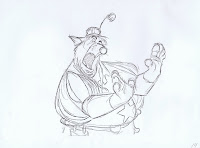
I found out the more I held back and showed him thinking and plotting, the more evil and interesting he became. Sure there were scenes when eccentric acting was called for such as when Jafar turns into a beggar. The attitudes here show a hunger for power as well as extreme frustration.
All those scenes were animated beautifully by Kathy Zielinski.
Other animators in the Jafar unit were Nik Ranieri, Ken Duncan, Ron Husband and Lou Dellarosa.

Many different design ideas were floating around early on, before animation began.


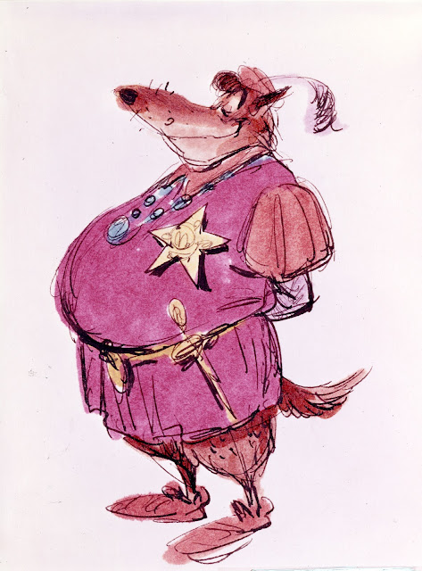
A fun drawing by designer/story artist Daan Jippes.


This sketch by director John Musker showed just the right attitude to go along with Jonathan Freeman's voice recordings. 


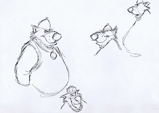
A couple of my early drawings with extra evil eyebrows. Didn't feel right though.


I order to loosen up I scribbled many facial expressions to explore the range of his facial features.
Setting Jafar's mouth very low on his face allowed me to create bizarre but interesting mouth shapes. 


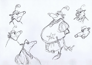
My attempt to tie down some of those rough faces.


How realistic or how cartoony should his hands look like? I knew I wanted hands you wouldn't want to touch.


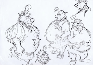
Premature cleanup studies. The right type of personality is emerging, but his face has way too many angles and planes. Too complicated to look at and not in line with the style of the film.


Jean Gillmore drew these expressive poses. 


I tried to minimize the line milage in the design. Still not stylized enough.


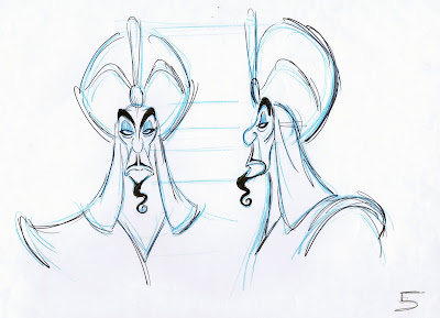
After one more pass I was comfortable with these animatable shapes.
This is the design directors Ron Clements and John Musker approved.


Clean up artist Kathy Baily creates the fine line look for the character.


An oversized drawing of Jafar with a cut out Iago provided by animator Will Finn.


I don't particularly enjoy drawing model sheets, it's all about measuring the components of the character and being consistent. They are important though because they explain the character "graphically" to your animation and clean up crew.


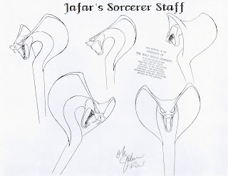
A cool design for Jafar's staff. We decided to close the snake's mouth though to save line mileage.
It probably saved the film's budget, too :)


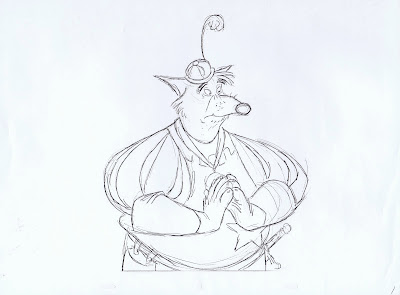
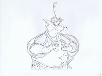
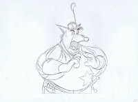
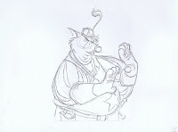
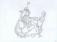
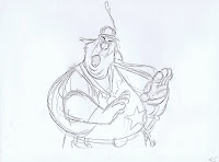
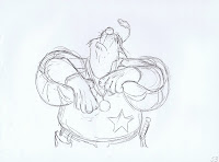
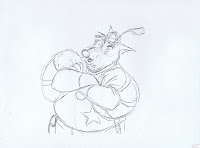
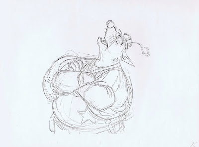
A couple of my more or less typical roughs.


This is a clean up drawing from a scene that was cut from the movie 
Jafar is muttering the magic word to make the gigantic tiger head appear in the desert.
That magic word was the name of our layout supervisor: Rasoul Azadani


Jonathan Freeman voiced the character perfectly, He loved being Jafar, and I loved animating to his inspired vocal performances.


Atlanta, Georgia 1946

$
0
0


I did a little research to find out what's going on in this vintage photograph.
Posing behind this very impressive car are Disney artists, from left to right story man Bill Peet, unknown, background stylist Claude Coats, art director Ken Anderson, director Wilfred Jackson and directing animator Milt Kahl.
If you look closer you see a Song of the South sticker taped to the windshield. The car to the right has one, too.
These gentlemen are attending the world premiere of Disney's Song of the South, a film that mixes live action and animation footage. 
"The animation in Song of the South was a high for us"  Milt Kahl reminisced years later.
I would add that the film has some of the richest characters ever that were animated with razor-sharp timing. 

Incidentally Walt Disney and his wife Lilian were driven to the premiere in this car as you can see in this great picture from the Library of Georgia State University.


A beautiful Ken Anderson illustration for the title sequence of the film.


Staging Pongo and Perdita II

$
0
0


Storyman Bill Peet drew this story sketch of Pongo and Perdi enjoying a peaceful moment together just before their lives would change with the upcoming visit of Cruella De Vil to the house.
For animation Ollie Johnston considered a different type of staging, more of a downshot of the two dogs through the window.


Frank Thomas referred back to Peet's staging, but simplified the silhouettes by hiding the dog's legs.
He also changed Perdita's head angle which makes for a better contact with Pongo. Even in this very rough sketch Pongo's muzzle reacts nicely to the hard surface of the windowsill.


Milt Kahl started out be defining Pongo's  appearance more clearly. It seems like he wasn't entirely happy with this version.


So he redrew it and referenced Frank's muzzle shape. Milt also felt that leaving out the dog's legs would simplify the staging, and guide the viewer's eye to the center of the frame, the Dalmatians' heads contacting.
There is also an abstract quality to the composition. The contour of the dog's bodies looks like an idyllic landscape with little hills and valleys. (The calm before the storm).
Milt did this sort of thing intuitively, he could never explain it.


There is no photo of Pongo's voice actor Rod Taylor working at the Disney studio to be found.
He either was photo shy or he chose early on not to promote the film.
Here is a picture of co-director Clyde Geronimi showing actress Lisa Daniels a story sequence.
Lisa voiced the character of Perdita. (Not to get confused with Lisa Davis, who voiced Anita.)


Runaway Brain

$
0
0


This short film was produced right after Lion King, but not at the Burbank studio.
A group of very talented artists in Paris/France had completed work on The Goofy Movie for Disney, and the plan was to have this terrific French studio be part of Feature Animation's films.
To start out it was decided to do a short with Mickey. Endless ideas were thrown around, but nothing seemed to stick. Then story man Tim Hauser had the idea to do a satire on the old Frankenstein story. I had too much fun sketching little Mickey monsters, like the ones above, before animation.
I was lucky to be sent to Paris along with a small group of supervisors. My job was to animate but also help supervise the animation as a whole.
Let me tell you, there was no hand holding necessary on my part, the French animators were fantastic. They were Bohlem Bouchiba, Uli Meyer (from London), Chris Bradley (from the US),
Dominique Montrey, Sylvain Deboissy, Sergio Pablos, Patrick Delage, Catherine Poulin, Marc Eoche Duval, Yoshimichi Tumara and Stephane Sainte-Foi.

I ended up animating a few opening scenes with Mickey and Pluto, the introduction of mad scientist Dr. Frankenollie and other shots here and there. 
One scene was a bit challenging, but a lot of fun.
Minnie is hugging Mickey because she mistakenly thinks they are going to Hawaii on vacation.
Mickey, shocked over this misunderstanding, pronounces the word "Hawaii" silently.
It was an unusual bit of acting for him, but I think it communicates.

These are a few of my rough animation keys from the opening scene. I remember animating the cord coming from Mickey's remote control, something that normally an effects animator would take care of. I really enjoy doing effects work once in a while.


The short was art directed by Ian Gooding and I think it looks beautiful.
A couple of pages from the Disney book "Mickey Mouse, My Life in Pictures".


Soon after the release I got my hands on a cool looking toy figurine from Japan.


This was the back of our crew jackets.
I wore it once while visiting Disneyland Paris, when suddenly a Disney sales person commented on the image, which she found outrageous. I tried to explain about the movie, but she insisted I shouldn't be wearing something like this in the park. She thought it was a counterfeit product.
Adorable…the way she was defending Mickey's image!


By the way, at the time I thought director Chris Bailey paced the film a little too fast, but watching it now, it feels just right.
You can find it on the Walt Disney Treasures DVD Mickey Mouse in Living Color, Volume Two.

Christmas Cards

$
0
0


Many animators like to send out Christmas cards, because they can draw them themselves.
Lounsbery, Kimball, Marc Davis, Frank and Ollie, they all sent out drawn holiday greetings over the years. Not Milt Kahl. 
Remember, he said: I only draw when I have to.
In the early 1980ies I sent Milt this card with a self caricature to wish him and his wife Julie Happy Holidays.
Julie told me later, Milt doesn't do Christmas cards, but she had asked him to send me one in return.
I treasure this card. Milt picked this store bought card with a graphic image of Santa, and the open invitation to see him and Julie is very special to me!!


Invisible Ink

$
0
0


This picture was taken sometime in 1987 when Steven Spielberg was visiting the animation crew in London. We were early on in production for "Who Framed Roger Rabbit". 
I believe Mr Spielberg had his picture taken with almost everybody in the animation crew. And he signed all those photos, too.
The camera that day sure didn't capture what I was working on, so it looks like I only have a blank sheet of paper to show for. 
Steven Spielberg is a very cool guy. He talks to you on the same level, from one filmmaker to another. I remember his enthusiasm for film and animation.
A few years later I even had the chance to have breakfast with him at the newly founded Dreamworks Studio. And again I felt like I could comfortably talk to this movie giant about anything, film or otherwise. I remember asking him if I could stop by the set of Jurassic Park II. He said, you won't be seeing any dinosaurs, there's just a lot of waiting around on the set. (I didn't end up going.)

I've kept shockingly little of my animation drawings from Roger Rabbit.
Here is a sketch with the Weasels' leader Smart Ass. I enjoyed animating his introduction very much.
He was interacting with live action props like a chair and a pistol, then he threatened Bob Hoskins: "Where's the Rabbit?" 


I also did the Bouncer at the Ink & Paint Club. Completely different character, powerful, slow moving like a big oaf.  So I had the chance to animate a lot of different character concepts for the film, and I learned a ton.


A post-Academy Awards-photo with Dick Williams, his mother and some of the animation crew.
Good times!! 


Wilhelm M. Busch 1971

$
0
0

These wonderful spot illustrations by Wilhelm M. Busch were published in 1971 in a little German book titled "Graf Bobby" (Earl Bobby).
This is the result when a realistic master draughtsman loosens up and caricatures his human subjects. Every drawing is entertaining and full of personality. The lack of formulas in them is refreshing and his economy of lines is inspired. I often find what an artist leaves out just as interesting as what he puts in. 
Great looking characters, beautifully staged, all this totally applies to animation.

Graf Bobby was a popular character in the German speaking countries, the humor in his stories range from silly to philosophical.


Sleeping Beauty Story Meeting

$
0
0


The artists attending the meeting from left to right are sequence director Eric Larson, story artist Joe Rinaldi, production designer Don DaGradi and directing animator Marc Davis.
The storyboards behind Eric are part of the "Boy meets Girl" sequence, which he directed.
Everything went into this section, the most elaborate backgrounds, multiplane shots with animation from Milt Kahl, Marc Davis and John Lounsbery. All this turned out to be very expensive, and when the sequence went far over budget, Walt Disney was not too happy about it. I am sure he had a word or two with Eric.
Next time you watch the film, keep in mind that Eric did his best to make this an outstanding sequence, but he caught some flak nevertheless.

The boards being discussed show the Three Fairies in the jewel box. If you remember they are trying to figure out how to deal with Maleficent's curse.
Marc Davis brought some of his character designs of Maleficent and the raven to the meeting. They are on the floor along with DaGradi's compositional studies.

What a great captured moment in Disney history!
I might read too much into it, but Eric Larson looks a bit distraught while Marc Davis' expression seems sympathetic toward him: It's gonna be ok, Eric.
Click twice on the image, and you are in the room with these guys.

Here are copies of Marc's sketches. He depicted Maleficent's colors in black and red, a concept he saw in a book on medieval art. Marc told me years ago that he felt strongly about those colors, but background and color stylist Eyvind Earle had other ideas and settled for black with purple.
Sometimes teamwork isn't easy.


Extraordinary sinister poses for the raven. What beautiful shapes!


Marc also did design work for various crowd scenes, in vibrant colors. 
The crowds in the final film are more of a backdrop and show less personality.
If these are supposed to be caricatures of studio personal, then the guy in the middle back is a dead ringer for a very old Milt Kahl! And maybe...just maybe the character on the left is a self portrait.


Sarah and Mushka

$
0
0

I will be living with these two for a while, since they are the main characters of my animated film.
It is a story of love and sacrifice, set in Russia. I have been working on story and pre-production throughout the year and will go into production next year.
The style will be a sort of like an animated sketchbook. I had been wondering if instead of using digital color I could just use color pencil shading right on the animation drawings. When applied very carefully the flickering will be minimal. 
Here are just a few character studies to give you an idea where I am going with this.
Luckily the LA Zoo had a couple of tiger cubs (they are almost fully grown now), so I did spend some time there to observe and sketch them. 


This is a little teaser I put together. The idea behind the scene is that Sarah, who is raising this tiger cub, realizes for the first time that even at this young age he already has a "killer instinct".


All artwork and video © Andreas Deja

Underwater Santa

$
0
0


This is a Christmas card I sent out in 1989 after we had finished work on The Little Mermaid.
So today I am recycling the image to offer everybody who celebrates this holiday my best wishes and to all of you, have a happy 2013.

Realism and Abstraction

$
0
0


For most Disney animated feature productions the research that helps to get the best results on the screen seems endless. Before animation begins storyboards are drawn and redrawn, various styles are being explored in order to achieve the right look for the film, and often live action is shot to help animators with their acting choices.
For the movie Peter Pan a lot of live action footage was filmed, and the super talented animators knew just how to use it. If the acting was inspired, why not incorporate it into your animation?
Usually timing and staging needed to be altered, because graphic animation has its own rules. Broader action, more squash and stretch and a clear silhouette.

I just love looking at these vintage photostats that were made available to the animators.
You can see what motivated them and how they translated the footage into graphic motion. Sometimes they would ignore the live action and create a different performance on their own. But as Marc Davis said, it was often helpful to be able to look at something instead of starting with a blank sheet of paper.

I myself worked with live action reference for Gaston and Hercules. We did it the same way by filming the actors wearing somewhat crude outfits, and by using the simplest of props to create some kind of an environment for the scene.
Sometimes those on the set were laughing so hard at how ridiculous (yet useful) the footage came out. If the studio could only make that footage available to you guys, you would laugh you head off.


Artists like Mary Blair preferred to present sceneries, characters and colors in an almost abstract way. With a strong focus on lighting, emotional color choices and simple staging these studies were the inspiration for the final artwork. Sure, the production backgrounds have a more realistic stage set feel, but Mary's influence is very apparent.
Eywind Earle took a similar approach for Sleeping Beauty and so did Walt Peregoy for 101 Dalmatians.


In the end this and other films landed somewhere in-between realistic and abstract influences.
And I do believe that's one reason for their greatness.

Amelia & Abigail Gabble

$
0
0


In June of 1969 these concept drawings by Ken Anderson were photographed and reproduced as reference for any artists who would be working on these two geese sisters in story and animation.
The movie was The Aristocats, and the script called for a couple of English geese, who are on a walking tour of France. These two are easily amused and tend to laugh at their own jokes. Their main purpose in the story is to accompany the cats on their way back to Paris.


Milt Kahl was next in line to  add his touch to the visual development of these characters. 
I can't quite figure out the following two sheets, who show a completely different conceptual direction for the geese. The drawings are hilarious, though these sketches look somewhat like ducks. The dishevelled attitudes remind me of Uncle Waldo, who almost got marinated in white wine at Le Petit Cafe.
Perhaps Uncle Waldo was an Aunt at one point, and that's what Milt explored here. Beautiful drawings!


And then Milt just hits a slam dunk! These are among my favorite Kahl exploratory  sketches.
Now this is a goose!!
With a fantastic facial caricature of the animal. It is bottom heavy and bow-legged.
I have looked at this sheet for hours.
I see a goose in France, I can almost taste the Foi gras, the proportions are exquisite.
A little masterpiece in design development.


Ollie Johnston looks at Milt's ideas, but looses something as he redraws the poses.
The longer neck is fine, but this is a skinny goose. And the head doesn't have that perfect simplicity.


As Ollie explores the proportions more, he eventually ends up adding the body bulk that makes for a good goose design.


By the time he gets into animation, his drawings become more solid, and the acting is terrific.


These are Ollie's motion studies based on looking at live action footage.
The sequene of the goose walking toward camera is worth taking a look at. 
You have the foot contact, then the body's weight shifts toward that side, while head and neck counterbalance. Of course all this needs to be exaggerated in the character animation.


Here is a photo from a magazine article, showing Ollie and Milt holding cats, while director Woolie Reitherman and Frank Thomas watch John Lounsbery, as he tries to put a bonnet on a goose.
But what's Mickey doing there?


The Art of Sleeping Beauty

$
0
0


You don't hear or read much about Les Clark in regards to the production of Sleeping Beauty.
That's him in the photo, examining a color model cel with various poses of Aurora, held by Grace Bailey, who was then head of the ink & paint department.
Les directed the enormously complex opening sequence of the film with endless crowds of well wishers approaching the castle. (Ruthie Thompson, who did scene planning on the sequence said recently that this was the most difficult and involved work she ever did at the studio.)

Below are a couple of sheets showing sketches of Aurora by the very talented modernist designer Tom Oreb. They date back to April and May of 1954. Oreb was a huge influence, as the Disney style underwent a transformation from round dimensional imagery to flat and graphic sophistication.


Marc Davis used these inspirational sketches and made the design his own.


Jafar Pencil Tests

$
0
0

I finally got around to putting a reel together with my Jafar rough animation.
It was strange looking at this footage again after so many years. 
Some of the scenes don't hold up as well as others. To give you a couple of examples:
The line "Your Majesty certainly has a way with dumb animals" needs a juicier acting approach. There is something in Jafar's attitude that I could have milked more.
On the other hand, the close up scene "I think she took it rather well" still comes off pretty good. (So does the preceding sequence with Jafar and Jasmine.)

I had a blast animating this character. As I mentioned before, he was a relief after Gaston's realism.

The reel shows scenes in various stages, from first rough pass to tied down inbetweened footage. There are also a couple of versions of a cleaned up scene that was eventually cut from the film, you'll find it.
The first clip was cut as well, the second one is an experimental scene.
Sometimes the sync is a little off, which was fixed for the final version (I hope it was, anyway.)

Any Iago acting scenes were animated by Will Finn, and Jasmine was drawn by Mark Henn, both beautifully done.
As far as I know everybody had a great time working on this film under the direction of Ron Clements and John Musker. We did receive some criticism though from some of the Nine Old Men, they thought that certain scenes and the contemporary dialogue would date the film.
If so, I think it is dated in a beautiful way.

Here is a link to some Jafar development art from a recent post:


TS Sullivant 6

$
0
0

Another reminder that shows how brilliant Sullivant was with his unique style for caricaturing animals and humans.
Feast your eyes!


The Collie

$
0
0


The Collie in 101 Dalmatians was animated by Julius Svendsen and voiced by actor Tom Conway who was the brother of George Sanders (Shere Khan).
Milt Kahl drew these beautiful designs to explore the final look of the Collie.

It isn't an easy thing to humanize a dog like this one, the long snout makes it difficult to portray a smile. The edges of the mouth need to move close to the eyes, which could look awkward.
But if anybody could pull it off it would be Milt. He had to deal with a similar challenge on characters like Bambi's mother, Prince Phillp's horse Samson and Frou Frou in The Aristocats.


Young Lady

$
0
0


This lovely story sketch was drawn by Joe Rinaldi, whose work is frequently mistaken for Bill Peet's.
Both artists show a lot of confidence and flair in the lines they put on paper.
They were also able to get the essence of a situation into one sketch.
While Lady & Tramp was in production, Peet developed story sequences for Sleeping Beauty.
The drawing below from the opening sequence of the film is Rinaldi's as well.


Animator Ken O'Brian was inspired by live action reference for the scene in which Lady is being presented as a Christmas gift. The actress in the photo is Jane Boyd, who was an artist in the effects department. (When I started at Disney in 1980 Jane was doing effects for The Fox & the Hound.)
As you can see, O'Brian did beautiful work on the film's human characters. There is a nice cohesive and rhythmic quality to his drawings.


This article from Look Magazine talks about singer and songwriter Peggy Lee's involvement with Lady & Tramp.


The Sheriff of Nottingham

$
0
0


The process of visual development for a Disney character during the 1970ies involved only a few steps compared to much earlier Disney films.
For productions like Snow white, Pinocchio and Fantasia many artists, who were part of Joe Grant's Model Department, contributed endless designs, sculptures and rough model sheets that eventually led to the final look of the characters.
After the completion of Sleeping Beauty a lot of artistic personal was let go in order to streamline future productions and to save money. By the time the 70ies came around, the animation staff had gotten even smaller. There were only FOUR supervising animators, who carried a lot of weight and responsibility.
Ken Anderson would start out with rough character designs such as these marker sketches above and below.


Once a certain personality type emerged, Ken's drawings went straight to Milt Kahl's desk.
Milt then polished the design 'to make it animatable" as he put it. Putting his own personal stamp on to the look of the character didn't make things easy for other animators, because nobody could draw like he did. 
Model sheets were made up of drawings from Kahl's early animated scenes…and that was it.
No construction sheets, no head or body turn arounds like in the old days.

The Sheriff of Nottingham has always been a sort of enigma to me.
I love the way he moves and acts, and his personality is interesting….it's just that he doesn't resemble a wolf, he looks like a huge rat. His soldiers are caricatured wolves, but not the sheriff.
These Milt Kahl sketches show how he developed the character based on Ken's work.


A few roughs from a scene in which the Sheriff argues with Friar Tuck.
"Now take it easy, Friar. I'm just doing my duty."
Beautiful stuff!


Prince John & Sir Hiss Pencil Test

$
0
0


Ollie Johnston animated this sequence, which introduces the comic villain and his sidekick snake.
Somehow the pencil test seems to reveal more subtleties in the animation than the final color footage, most of us are used to.
This is clean up animation, Ollie's original roughs were a bit looser. Also, Prince John's  crown with all its diamonds was finalized by an effects animator. Ollie just drew the main shape of it.
What beautiful dimensional animation!

Pardon the picture quality here, this was part of an old TV show from the early 1970ies.
The clip starts out with the story reel version, and it looks like Ken Anderson drew those sketches. 


Viewing all 1326 articles
Browse latest View live