Quantcast
Channel: Deja View
Viewing all 1315 articles
Browse latest View live

Walt and Ludwig

$
0
0

As a kid I've always loved TV shows in which Walt appeared alongside this befuddled character, Professor Ludwig van Drake. With Paul Frees' voice work and terrific animation by some of Disney's best artists, Ludwig discussed a variety of topics such as education and how color television works.
Two shows from 1961 stand out to me, An Adventure in Color and Kids is Kids. I think that Milt Kahl and Frank Thomas had the best handle on the character, there scenes are alive and very entertaining.


For more on Ludwig van Drake, go to this previous post:


Back Online

$
0
0

I apologize for the long post-less time period. A few weeks ago I left for Italy in such a rush, I completely forgot to announce a break regarding my blog.
The folks from the famous Nemo Academy in Florence invited me as well as Ted Thomas (Frank Thomas' son) to give a few lectures to their students. That's both of us in the photo, including our translator, who occasionally needed to interrupt, when our monologues became to long for proper translation.
Ted screened and discussed some of the great documentary films he had produced over the years with his wife Kuniko. As for myself, I talked about 31 years at Disney Animation, but also about my film Mushka. The students' enthusiastic response took us completely by surprise.

The title cover of a limited edition exhibition catalogue. 


How about having your art exhibited in a room like this one ?!!!


Francesco, Luca and Federica...you spoiled us! This was the trip of a lifetime.

Sketchbook St. Pauli

$
0
0

St. Pauli is is a region in Hamburg, Germany that includes the city's red light district. This sketchbook by Wilhelm M. Busch was published in 1987, the last year of his life, but I don't know exactly when these drawings were made. In any case, Busch's masterful draughtsmanship comes through in every sketch featuring a dicey subject matter.


Animated Elegance

$
0
0

Here is another post featuring Madame Bonfamille from The Aristcats. I sort of have a thing about the film's opening sequence, which introduces the main human characters. Edgar, the butler, George Hautecourt, the lawyer, and Madame, all animated beautifully by Milt Kahl. 
Disney's earlier film Sleeping Beauty was labelled as "Moving Illustration", well, so is this sequence.
Character acting and draughtsmanship are so sophisticated, and because of black Xerox, all that great drawing is in your face (in a good way.) Milt enjoyed animating the butler and the lawyer, less so Madame Bonfamille. But her portrayal is so elegant and charming, I can't take my eyes off her. 
Don't get me wrong, I enjoy crazy Tex Avery type animation just as much, but I can also appreciate subtle, realistic animation concepts, particularly when done so brilliantly.

As part of the Disney animation Training Program during the late 1970s, xeroxes were made of several Milt rough scenes. These served as a teaching tool for clean up assignments. I have a number of those xeroxed scenes, and will post them in the near future. Here Madame is looking at her reflection in the mirror before the arrival of her old friend George Hautecourt.
The Vis Dev color sketch is by Ken Anderson.


More posts with this character here:

and here:


Nobertine Bresslern-Roth

$
0
0

Nobertine Bresslern-Roth was an extremely gifted Austrian painter and graphic artist. She lived from 1891 until 1978. She was an expert in depicting animals either in portraits or in dramatic situations like the one above. I can't believe I just recently found out about her astonishing work. Her main medium was the linocut, but she was also comfortable with oil and watercolor.
In 1928 she traveled to North Africa, a trip that stimulated her talent as an animal artist.
What can I say...only superlatives are in order to describe her work justly. Her knowledge of anatomy, her compositions, her color...everything is top notch! What an inspiration!!!


I believe these images which show a considerable amount of rendering represent her earlier work.


Roquefort

$
0
0

This sympathetic mouse character from the 1970 Disney film The Aristocats was animated by my mentor Eric Larson. Eric enjoyed one of his last animation assignments, before focusing full time on training new people joining Disney during the late 1970s.
Milt Kahl came up with this early design concept above, heavily based on Bill Peet's earlier concept for the character of Amos from the 1953 featurette Ben and Me. 


As much a I like Milt's drawings, Eric created a new mouse for Disney Animation, which was certainly a challenge, within a medium full of mice characters. Eric remains one of the most underrated animators. No matter what the assignment, animal crowds on Snow White, the cat Figaro in Pinocchio, Flying Horses in Fantasia, Eric performed these characters  believably and beautifully.
He was a Master animator!!

More Mme Bonfamille

$
0
0


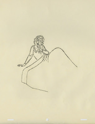
It seems extraordinary to realize that Milt Kahl animated Mme Bonfamille's scenes without any live action reference. Milt had such command and control over the mechanics of the human body, he was able to animate any human type out of his head, realistic or caricatured.
This character is as close to total realism as you could possibly get. Milt employed the might of his drawing powers as well as subtle acting to bring her too life. He reminisced later that he thought the one moment in which she comes alive is when she finds her cats gone. She shows strong feelings there, allowing Milt to show her emotionally engaged.
These rough animation drawings are from that sequence. It starts with Mme Bonfamille waking up during a stormy night.


#1


#27


#35


#43


#51


#59


#67


#73


#79


#111


#149


#181


She puts on a gown and approaches the cats' night quarter. (What stunning drawings.)


A tight close up shows her disbelief.


#7


#31


#51


#71


She runs out of her bedroom and calls for her cats.


#9


#11


#15


#87


#104


About characters like this one Milt said that though not very enjoyable to do, you know that you DO have more entertaining characters in the picture, so it doesn't hurt to do a straight job once in a while.

A Lecture on Animating Hercules

$
0
0

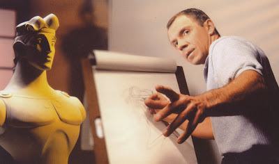
That photo was taken years ago after we had just finished work on the 1997 film Hercules. I had fun animating this character, even though it was a challenging assignment. Though stylized in appearance, his acting needed to be pretty realistic in order to communicate subtle emotions like self doubt, shyness and falling in love.
I will talk more about Hercules and share original never before shown pencil tests this coming Saturday, May 16, at 11 am PDT. My friends at Virtual Animators will make this event possible. If you are interested in joining me, here is the link:


Celebrating Pinocchio

$
0
0

I don't know why there isn't more hullabaloo around Pinocchio's 75th anniversary. The film remains a milestone in animation history. Artistically and in terms of dedication there is no other film like it.
Walt and his studio were running in overdrive, there were worlds to conquer in animation.
Milt Kahl got his big break during the production of the film, he designed the title character and became a supervising animator.
Over the years Milt got criticized by his colleagues for not being emotionally enough involved in his work, and that great draughtsmanship became his main tool to communicate.
Take a look at these rough drawings featuring Geppetto's and Pinocchio's reunion.


Jiminy Cricket

$
0
0


Designing a character can be a tricky thing. Sometimes the first few sketches an artist does hit the mark right away, and everybody agrees that this is the character as he or she should appear in the film. Then again, occasionally there are those times when nothing you draw seems to please the directors or the studio chief.
I remember what troubles I had when trying to get the required appearance for Gaston. Scar by contrast was a breeze. 
Ward Kimball surely was looking forward to animating Jiminy Cricket, after the bad experience he just had on Snow White. His brilliantly animated "Soup Eating Sequence" had been cut from the film, and now it was time for a fresh start on the next feature film Pinocchio. Even though Walt Disney personally assigned the Cricket to Kimball, the animator didn't seem to be able to please the boss with his initial designs. Not appealing, too grotesque and insect like! After many revised versions in which Ward de-insectified the design, Walt finally approved a design that though very appealing had very little to do with the anatomy of a real cricket. 
Joe Grant came up with these early rough model sketches, shown above.

The folks over on Fantasia drew cricket designs like this one, when a variety of insects were part of a musical piece for the film. Kimball basically used this kind of concept for his initial Jiminy designs.


Joe Grant's model department created this maquette, based on early concepts. I really love this version of the character.


The final model, in Kimball's words, turned out to be a little man with an egg-shaped head.


This beautiful animation drawing by Ward shows that he came to terms with Walt's vision for the character. Frank and Ollie thought that his animation of Jiminy Cricket was the most sincere he ever did.


In case you don't know yet, there will be Christmas this May. At the end of the month, J. B. Kaufman's book on the making of Pinocchio will be out, and I guarantee that it will be a major treat.
Here is the link to Amazon:

http://www.amazon.com/Pinocchio-Making-Disney-J-B-Kaufman/dp/1616288094/ref=sr_1_1?s=books&ie=UTF8&qid=1431930372&sr=1-1&keywords=pinocchio


Some images are Heritage Auctions/Disney.

Milt Kahl Overload

$
0
0

Look at what blog reader Jeff created with images from this and other blogs...pretty impressive! A design wonderland! Milt's drawing style might have changed over the decades, but any of these drawings show a degree of excellence that is unmatched. What many people don't realize is that even his later graphic work has deep roots in a profound knowledge of realistic animals and humans.
You have to know stuff, so you can do stuff!

Jiminy Cricket II

$
0
0

A little bit more on Jiminy Cricket, Kimball's iconic character. This is gorgeous frame from one of the opening sequences of the film. Rembrandt lighting in a Disney film.
Young Ward, a kid really, working on a close up scene during the "Give a Little Whistle" song. ( ...which includes some dance moves by the cricket that blow my mind.)


That scene is part of this pencil test continuity sheet. Ollie Johnston did the Pinocchio scenes .


A beautiful layout featuring one of the film's first scenes. Even in pencil form, all that intricate lighting is worked out.


I never heard Ward talk in person about live action reference for Jiminy. Maybe he ignored the reference at the time, or he didn't want anybody to know. He shouldn't have worried, there is no trace of any live action in his brilliant animation. But...having seen some live action footage, I can see an influence.


Merchandise

$
0
0

A silly photo for a German magazine after The Lion King had been released. I remember the photographer being fascinated with some character figurines, which were placed on my animation desk. It was always interesting to see how your character would be represented as a fast food bonus toy or other merchandise articles. 
The animators were frequently involved in the development of such figurines. We were shown little models in a "work in progress" stage, and more often than not gave input to help bring the character on model. 


Any of these could be tweaked a bit more to make them look like the film's images, but there is a quirky and naive quality to these mini maquettes which I kind of like.


This t-shirt image was taken from an actual animation drawing.


Stylized films like Hercules present a challenge when representing the characters three dimensionally, 
there are many graphic cheats used in the animation that don't make a lot of sense from a logical point of view.


I believe this Roger Rabbit set was done exclusively for the Disney Parks,  Baby Herman came out perfect.


A t-shirt illustration based on one of my pre-production sketches.


An absolutely perfect representation of bad Mickey from Runaway Brain, produced in Japan.

Chernabog

$
0
0

It's astounding to see rare cels like this one from Fantasia. It shows it's age, but nonetheless showcases the overwhelming craftsmanship of Disney Animation during the golden age.
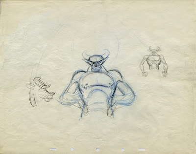
The Devil on Bald Mountain remains to this day the most impressive, fearful and powerful animated character. His animation on screen lasts only a few tens of seconds, but every scene is pushed to the limit in terms of nightmarish horror, but also elegance of motion.
The scene in which Chernabog's hands play with flames to turn them into figures has such magnificent fluidity, the upper hand seems to be dancing with the fire.

The sequence was thoroughly researched, designed, staged and storyboarded for optimum effect.


Bill Tytla's exploratory research as well as his rough animation drawings showcase an artist's intense relationship with his subject. There is a raw power that seems to come from within the earth.


Even the clean up work on the character retains the awe-inspiring emotion of Tytla's rough drawings.
The flawlessly drawn anatomy helps to give the sequence a level believability and authority never achieved before.


A couple more cels of Chernabog that seemed to have survived the ages to haunt us, even as still images.


Joe Grant's model department created this dynamic maquette for Tytla. It served as a reminder to bulk up the live action reference, in which skinny director Wilfred Jackson acted out the scenes.


Images Disney/Bonhams and Heritage Auctions

More on Tytla's work here in this previous post:


Einstein and Dodger

$
0
0


I only worked briefly on the film Oliver & Company, before moving to London to animate on Who Framed Roger Rabbit instead. These are a couple of leftover design sheets for Einstein and Dodger.
I remember trying (but failing) to come up with design that wouldn't remind the audience of other Disney dogs. Dodger looks like Tramp's little cousin, and Einstein...well, you know.
I had the chance to do a pass for all characters, including Fagin, who turned out somewhat more original.
I'll post other design doodles from the film once I locate them.


Hercules Pencil Tests

$
0
0

For the longest time I had written off my tape with Hercules pencil tests as lost. But that tape recently resurfaced, and looking at the footage now brings back a lot of memories. I was one of the last animators to finalize the character's design, everybody else had found a way to incorporate graphic elements, found in the work of British illustrator Gerald Scarfe, whose edgy drawing style served as the inspiration for the film's overall look. 
As Hercules' personality was developing I felt I needed to take it easy as far as heavy stylization. He was supposed to be shy around girls and frustrated at the lack of progress in trying to become a hero.
A little clumsy, but good natured and ambitious.
In the end Adult Hercules shows only a minor Scarfe influence, just enough to fit in with the rest of the cast of characters. 
While animating I recall trying to get to the core of his emotion, which presented a challenge during short scenes. I often thought that a bit more footage for certain scenes would help me to get the business across in a stronger way.
Actor Robert Gant acted out most scenes, and I enjoyed the process of doodling thumbnail sketches in front of a monitor. That way I could pick and chose poses I liked, and eliminate others that didn't work for me. Overall the live action reference was very helpful.
The reel includes first pass animation pose tests as well as final refined versions. There are a whole bunch of scenes I'd like to rework, others I am ok with.

Here is the link to an earlier post about Hercules' design evolution:

http://andreasdeja.blogspot.com/2013/06/hercules.html

All Eyes on Flower

$
0
0

A beautifully staged publicity sketch for the film Bambi. At the center of attention is the skunk Flower, who is being told that even he could become twitterpated.
Bambi's, Thumper's and particularly Owl's pose clearly help guide the viewer's attention toward Flower, who stands isolated in the lower left corner. A simple and very effective composition.

Here is a link to an earlier post about Bambi book layouts:

http://andreasdeja.blogspot.com/2011/12/bambi-book-layouts.html

Remembering Ollie

$
0
0


For some reason I have been thinking about Ollie Johnston for the last few days. I guess I miss calling and visiting him. It's been already seven years since Ollie passed away, to me it seems like only yesterday. It was always wonderful to get together, Ollie never minded answering all my questions regarding his work. One thing I remember was his utter respect and devotion to his boss Walt Disney. And I was stunned when, out of the blue, he once said: "I think Walt would have liked working with you." He knew I was passionate about animation, but hearing it like this....
The above image appeared in the trade papers when Ollie passed on, I was a little involved in designing this page.


As a train enthusiast Ollie drew this funny self portrait next to his lovely wife Marie.
Image/Howard Lowery Auctions.


A field day to the Johnston residence, which involved riding his train.
Ollie, Andy Gaskill, Steve Fiott (publisher of Storyboard Magazine), Hans Bacher and yours truly.


There was a party celebrating Ollie's 90th birthday at Disney Feature Animation. Next to me is Ed Oboza, Ollie's dedicated house keeper, and of course the one and only!

There is plenty of Ollie's work throughout this blog, here is a previous post that shows his range of characters:
http://andreasdeja.blogspot.com/2011/06/ollie-johnston.html

The Way to Use Live Action...

$
0
0

....is basically like this. Study the reference and PLUS it.
The two poses in the photo already give you nice silhouettes. Everything reads very clearly, but look what happened when the animators got a hold of this material! Hook is leaning forward instead of back. It makes for a more dynamic pose, but more importantly it connects him more with the object of his interest in the sky. And Smee definitely leans backward in anticipation and fear of the ship's canon going off.  I love the fact that he pulls his cap all the way down to his nose, and using his thumbs instead of index fingers to block his ears is an interesting choice. (I never would have thought of that.)


Hook was animated by John Lounsbery, Smee by Ollie Johnston.

Leftover African Cats

$
0
0


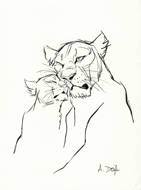
Here are just a few animal sketches in brush pen, that didn't make it to the final selection of drawings I made to help promote the 2011 Disney film "African Cats". These sketches were not made from real life. Instead I drew these poses looking at a TV monitor showing a very low res version of the film.
I believe any artist studying wildlife needs to include film footage as a resource. You just don't always get interesting animal behavior from looking at a sleeping lion at the zoo. Don't get me wrong, drawing at the zoo is incredibly important, after all you are in the presence of the actual animal.
It's just that they don't hunt, fight or make love (well, sometimes they do.)
I can't wait for the next BBC nature documentary, their cameramen are amazing. So are Beverly and Dereck Joubert, who work for National Geographic. 


Here is the original post for "African Cats":


Viewing all 1315 articles
Browse latest View live