Quantcast
Channel: Deja View
Viewing all 1315 articles
Browse latest View live

Simply Great Drawings

$
0
0

This amazing stylized drawing of Aurora reminds me of the graphic quality found in church stain glass windows. This clean up image is small in its original size, but look at the precision of each pencil line. The shape arrangement is incredible. This is what happens when you combine the efforts of talents like Tom Oreb, Marc Davis and Iwao Takamoto.


Same movie, a rough animation drawing of the male lead, Prince Phillip. He is in mid action, about to pull on his horse's reins to turn screen right. Animator Milt Kahl had become obsessed with depicting hands in the absolute best way possible, in a single drawing as well as in motion. 
Making a handsome male face look good from this angle is no small feat either. 


Four of the Dwarfs from Snow White try to stop Sneezy from yet another explosive exhale. I assume that the story sketch for this scene already showed interesting staging, but only Fred Moore could make a this situation communicate in such a simple, but entertaining way. Four hands holding up one nose should be impossible to draw, but here it is. 


A great study of the head of a Tyrannosaurus Rex, drawn from a tough angle. Upshot, 3/4 rear.
Even with the aid of having a dinosaur maquette at hand, this perspective would be a challenge to any artist. Animator Woolie Reitherman gets it right by analyzing the main volumes first (head and neck), then focusing on how details like cheekbone and eye unit connect to the main mass.


When expressing Tony's volatile gestures, John Lounsbery knew that interesting and precisely drawn hands were very important to achieve entertaining character animation. People say that Lounsbery's drawing of hands looks identical to Kahl's, but I can see a difference. The definition of knuckles and the palm of hands differs, yet both artists were fearless when it comes to articulating the most complex hand moves.


The guts of early rubber hose animation is astounding. Anything goes in order to get gags across in a surprising and funny way. No extensive life drawing experience necessary. The animators were free to invent animation for absurd and surreal situations. 
I recently watched one of the old Oswald cartoons on the big screen, it made me laugh all the way through. This stuff is as timeless as the sophisticated feature films that followed. 

Most images/Heritage Auctions.


Sullivant 12

$
0
0


It's been a while since I posted any T.S. Sullivant material. So here are a few more high res scans right off original pages from Time and Judge Magazine, dating back from 1904 (image above) to 1925. What a blessing for us that this man was so incredibly prolific!


"See You All on Monday..."

$
0
0

John Lounsbery animated the "Friday Mickey segments" for The Mickey Mouse Club. He has a terrific handle on the character, who wears  a very involved Cowboy outfit with lots of detail.
You can tell that  Lounsbery enjoyed animating Mickey, every drawing is loaded with charm. He took the classic Fred Moore model and made it his own, a Mickey for the 1950s.
The drawing in which Mickey pulls his hat down is one of the most appealing Disney drawings I have ever seen!


Anita

$
0
0

I am lucky enough to count both of these artists as a friend. Frank Thomas and Lisa Davis, who voiced Anita in the Disney classic film 101 Dalmatians, interact with a couple of Dalmatian puppies at the studio around 1959 or 1960.
Frank did animate beautiful scenes with some of the puppies as well as their parents Pongo and Perdita, but none with Anita.
This character presented a design challenge as a new human leading lady. Marc Davis had just finished animation on Aurora for Sleeping Beauty, and his early scenes with Anita show a certain resemblance to the princess ( Anita and Roger meet awkwardly in the park before falling into a lake.)  Les Clark got involved and did a few scenes when the puppies are born, but it wasn't until Milt Kahl came on board that this heroine's final design was set for the film.


This cel shows a Marc Davis drawing for a Les Clark scene.
In the end Milt Kahl drew Anita looking like Julie Andrews, which was coincidental, because the actress wouldn't become a household name until Mary Poppins a few years later.


Lisa and I are planing to get together and discuss her involvement in the film. We will take a few photos to be posted here along with lots more artwork that will demonstrate Anita's visual development.  So stay tuned!

Menagerie Exhibit

$
0
0


In 2010 an exhibition about animal art opened at the Forest Lawn Museum in LA. I was a part of an eclectic group of artists who were asked to contribute to the show. Any medium was represented, drawing, painting and sculpture. The above illustration which was featured on the invitation is by artist Randy Dahlk.
I had two pieces in the exhibit, a wire sculpture of a toad, and a large watercolor of a lioness hunting a zebra.


The wildlife piece can be viewed here:


Look who stopped by the show's opening! Tyrus Wong, who also showcased a piece of art. It was a beautiful vis dev piece from Bambi. Unfortunately I don't have an image of it to show here. 


Today Tyrus is 104 and going strong. He is such an inspiration to me because he is constantly adapting to new challenges. After working at Disney on Bambi, he left the studio and produced stunning concept art for live action movies.
What a thrill to be included in an exhibit that featured art from this Disney Legend!!

Photos with Tyrus by Carla Fallberg. 

The One and Only...

$
0
0

I see the essence of Walt Disney animation in this cel. (And yes, I am the proud owner of this iconic piece of art). Pinocchio just before he comes to life. There is such a beautiful feeling of "wooden" WEIGHT. No question, based on a Milt Kahl drawing. The ultimate in appeal, color and...well, magic.
Milt, Frank and Ollie were very young animators when they all focused on the film's title character.
It must have been daunting to try and meet the standards set by senior, experienced  artists like Tytla, Fred Moore , Norm Ferguson and others. But the young guys proved that they were able to make major contributions.
Milt with his impeccable sense for design and dynamic motion, Frank with complex acting and Ollie with warm, sympathetic animation. SELF EXPRESSION by the animators was key in those days to make audiences believe in the personalities.
The visual development department generated equally inspired work.


Go and get this remarkable book on the making of this Disney masterpiece:


Pose to Pose or Straight Ahead...

$
0
0


is one of the topics I will discuss at my next online lecture with Virtual Animators this coming Saturday, June 27. Both approaches have benefits but also shortcomings.
The other issue I want to talk about is wether to chose realistic or cartoony animation for your scenes. Subtle or broad. Of course that has a lot to do with the design of the character.
I feel these are important things to discuss. Particularly young animators are faced with all kinds of such choices.
If you are interested in joining the discussion, here is the link to Virtual Animators:

http://events.r20.constantcontact.com/register/event;jsessionid=A2A8AF2EDB6B1FC3D2FD83E0FE8E81B2.worker_registrant?llr=einay4kab&oeidk=a07eb3xnuym09d0c674


This will be my last online lecture for a while, since production on my film Mushka is getting into full gear. I will give you an update on that as well.

Vintage Sullivant

$
0
0

This Sullivant illustration dates back to 1898. It is one of his earlier pieces, even though he was already in his mid 40s. Sullivant was somewhat of a late bloomer when it comes to finding a personal style (but what a style it was!) Cartoony, but very much anatomically correct.


I found this wonderful image online. It represents Sullivant's art in a polished and refined stage.
Can't take my eyes off his animals, they are the best!


When Live Action Reference doesn't help...

$
0
0

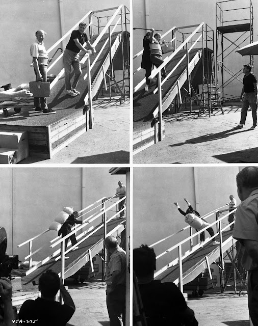
As I mentioned before, I like a lot of things in the film The Aristocats. But the sequence in which lawyer George Hautecourt takes the stairs with the help of Edgar, the butler, always baffled me. This is potentially a hysterical moment in the film. The old man refuses to use the elevator to get to Madame Bonfamille's parlor. The stairs will be just fine. Edgar comes to his aid, but things don't go so well.
Extensive live action was filmed to help animator John Lounsbery with ideas for comedic business.
Actually those ideas weren't half bad, it's just that every animated scene in the sequence looks stiff.
At one point the lawyer hangs on to Edgar's suspenders as he looses his balance. The elasticity of the suspenders causes him to move upward swiftly, resulting in a collision with Edgar.
It is surprising that none of this cartoony business shows any weight at all. Both characters seem to float around, never showcasing believable motion.
I remember Milt Kahl being critical of this section of the film. He said he would have handled the humor differently. To me it's the execution that falls flat.
Perhaps Lounsbery, a brilliant animator, found little inspiration in the live action reference.


Here is the link to the film's youtube clip:

https://www.youtube.com/watch?v=btKw8JjyVIU

Crocodile

$
0
0

More of John Lounsbery's work, this time undisputedly brilliant.
The crocodile in Peter Pan is for the most part a comedic villain, even it he ate one of Captain Hook's hands. Lounsbery animated the introductory scenes, as the croc approaches the ship in hopes to get the rest of Hook. This little sequence of beautiful rough animation drawings is not complete, it misses the pose above. Nevertheless, you can see the brain work that went into animating the scene, as the croc moves upward toward Smee, who is trying to shoo it away.
Look at how the reptile body raises up, back first, then neck, then the head. All to the musical tick tock beat. This is a complex scene, gorgeously executed. That's why we love Lounsbery!
The magic of pencil animation!


Here is a fun Milt Kahl pre-production drawing, the crocodile with bulging eyes.


Olivia de Havilland

$
0
0

Sometimes you just luck out!!
A few years ago I had the tremendous pleasure to be on a flight from LA to Paris, sitting next to none other than the lovely Olivia de Havilland. She is the last surviver from the cast of Gone with the Wind. It's kind of funny, before my flight I had just watched an interview with Ms de Havilland as part of the bonus material for the Gone With the Wind bluray disc. So I recognized her right away and said: " Miss de Havilland, let me tell you, it's a pleasure flying next to you." She gave me a friendly smile, and we settled into our seats. Before take off something amusing happened. At the same time we both pulled out of the seat pocket in front of us our own crossword puzzle booklet. We had a laugh, and she explained that crossword puzzles keep her mind sharp, while I told her that mine was in German, my first language.
During the flight Miss de Havilland talked about her career as an actress and shared memories from Gone with the Wind. She asked what profession I was in, and I told her that I had been with Walt Disney Studios as an animator. And that I was about to leave the company, because the studio would soon stop producing classically drawn animated films. I never forget her reaction in disbelief, she said: "Now why would they want to do that?"
When we landed in Paris I was able to assist her with the overhead luggage, and we parted ways.

Much later when I was researching character designs for my film Mushka, I remembered my encounter with Olivia de Havilland and modeled the look of Sarah's grandmother a little bit after her appearance. 
Olivia de Havilland has been living in Paris since 1960.

I wonder if I could get Ms de Havilland to do the voice for Sarah's grandmother...there is no harm in trying, right?

Milt's Design Doodles for the Beaver

$
0
0

I have had numerous posts on the film Lady and the Tramp, featuring one of its funniest characters,  the Beaver. Here is one more, since I just came across some beautiful design sketches by Milt Kahl.
As mentioned before the Beaver was animated by Milt as well as Eric Larson. And even though Eric's draughtsmanship was nowhere near of Milt's, their scenes blend together perfectly.
It is amazing to me and refreshing at the same time to see how expressive a character can be with relatively small eyes. Sullivant did and Milt too, in stark contrast to many of today's animation designs that feature gigantic alien eyes.
Milt based his design on Joe Rinaldi's story sketches, and the end result is so charming. The beaver sequence was the first footage from the film I saw as a kid, on German television. It holds a special place in my heart.


Here are links to previous Lady & Tramp posts, featuring the beaver:


Restaged

$
0
0

Disney Studios soundstage, late 1950s. Sleeping Beauty Live action reference is being filmed for the animators. A moment from the film's final sequence, the Happy Ending. I like the way the situation was staged in this photo stat: Princess Aurora is giving her father in law, King Hubert, a kiss on the cheek, before joining her hubby, Prince Phillip, for a dance.
When you look at this section from the actual film, the choreography is handled quite differently.
Aurora enters the frame from screen right, after being reunited with her parents, King Stefan and the Queen. On her way to be with Phillip she pauses to kiss King Hubert, remaining screen right.

This photo stat gives me an idea for a missed opportunity for a character moment.
What if Aurora rushes into the frame from screen right, she passes King Hubert, heading straight for Phillip who reaches for her hand. She then realizes that she forgot to give Hubert a kiss. She turnes back as pictured in the photo, then leaves with Phillip.

I think that's the way I would have handled this scene.


Disney and Dali

$
0
0


The Walt Disney Family Museum in San Francisco just opened a stunning exhibition about two of the greatest artists of the last century, Disney and Dali. You would think that their work couldn't differ more from each other, one is paradox and seemingly non sensical, the other revolutionary in its beauty and accessible to everyone. Yet both artists were surrealists, masters when it came to mixing reality with dreams.
The huge exhibit features many original paintings, drawings and video screens. You come away knowing that the two men had much in common, even beyond their attempted collaboration on the film Destino.
Go and treat yourself to a visit to the museum, I guarantee you, you will be amazed!


For more information about the exhibition, go to the museum's webpage:

http://www.waltdisney.org/dali


Busch, The Brothers Zemganno

$
0
0

I don't know when exactly this book was published, a date wasn't included in it.
My guess would be mid 1960s. It doesn't matter, the illustrations depicting scenes from the circus world are stunning. Beautifully rendered layouts and rich characters, always staged in the most effective way. What a standard for draughtsmanship!


By the way, check this out...what do you know??

https://d23.com/announcing-the-2015-disney-legends/

Tease

$
0
0

My upcoming book with Focal Press "The Nine Old Men: Lessons, Technique and Inspiration from Disney's Great Animators" will include a lot of never before seen animation art, including all key drawings from this Milt Kahl masterpiece.

Titanic with a Twist

$
0
0
© Andreas Deja

A watercolor sketch from a few years ago. Wouldn't it me fun to reenact classic Hollywood scenes in pencil animation?

Milt Kahl's Wendy

$
0
0

An early pre-animation, charming model sheet.

Milt wasn't happy at all when Walt Disney asked him to take on the animation for Peter Pan and Wendy. He had high hopes for getting assigned to Captain Hook. That character of course went to Frank Thomas. So when Frank showed his first scenes with Hook during a sweatbox session, Milt tore them to pieces: There is nothing here, no personality, drawing...these are nothing scenes.
Eventually he calmed down and started to focus on the two most realistic characters in the film, Peter and Wendy. Milt naturally wasn't afraid of realism, to him it wasn't as much fun as doing eccentric or comedic characters. But he did his best, and his animation shines throughout the film.
In order to make animated realism look good on the screen, top draughtsmanship is absolutely essential. Standard poses and head angles will result in boring scenes. Yet beautifully drawn head tilts, up and down angles add so much to the overall acting.

These drawings from Milt's scenes show his special skills for drawing any angle extremely well.


Here an assistant is tracing Milt's rough animation drawings in an effort to understand the complex drawing style.

The following copies show clean up drawings over Milt's rough keys from the song sequence "Your Mother and Mine". Look at the subtleties in Wendy's facial features.


Let Milt tell you himself how he felt about Peter and Wendy in this clip from a previous post:

http://andreasdeja.blogspot.com/2013/01/milt-kahl-talks-casting-on-peter-pan.html

Nana

$
0
0

Nana, who acts like a nanny to the Darling children, is a minor, but terrific character nevertheless in the film Peter Pan. She is handled in a somewhat cartoony, but still believable way by animator Norm Ferguson. She walks like a real dog, yet is able to act out human like business like in the film still above. Because she doesn't talk, the animator had to get the character's emotions across through pantomime performances. Ferguson had been an expert in animating Pluto, so he was well equipped to take on an assignment like this one.

A 1940 model sheet from the film's earlier concept period, drawn beautifully by J.P. Miller, who made Disney history when he provided final story sketches for BabyWeems. 


Just when you thought that Milt Kahl couldn't possibly have been involved with every Disney feature character, this roughly put together model sheet shows that he probably was. The length of the dog's jowls gave him a little trouble.


Mickey Magic

$
0
0


The Sorcerer Apprentice from Disney's grand experimental film Fantasia remains one of my all time pieces of film making. The idea of having a cartoon character commanding the forces of the universe must have sounded crazy and over the top to the Disney staff. But Walt Disney's vision for what the animated medium could do eclipsed everyone's imagination. To him this was not merely a cute cartoon business anymore "We have worlds to conquer."
And that he did, with Fantasia and so many other films and projects that followed.


I love the fact that Disney wasn't afraid of going into dark places. A Mouse's dream that turns into a frightening nightmare. Early German expressionist films had a profound influence on the Disney artists at that time. That studio was unstoppable!

Viewing all 1315 articles
Browse latest View live