Quantcast
Channel: Deja View
Viewing all 1315 articles
Browse latest View live

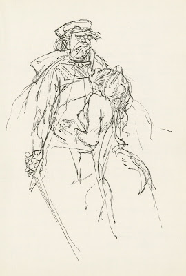
Wilhelm M. Busch 1959

$
0
0
To start off, let me inform you that my book on Disney's Nine Old Men has been published. If you order it from Amazon, it's not a pre-order anymore (even if it says so). Also, Amazon just added their "Look Inside" option, which allows you to check out quite a few pages. I am so thrilled about the book's layout.

Moving on...German illustrator Busch published Honore de Balzac's novel La Belle Imperia in 1959.
His drawings are quite a bit looser here than what you might expect from this modern master of book illustration. And there are plenty of ink drawings in this volume, which tells me that Busch truly enjoyed the subject matter. Look at the cinematic staging and the way characters relate to each other.
Makes me want to DRAW! Damned brilliant stuff!!


Milt's Thumper

$
0
0

We all know that Milt Kahl does "Eccentric" very well. Medusa, Madame Mim, the short TigerTrouble etc. He also does "Realism" well. Bambi, Peter Pan and Prince Phillip.
Of course he also had a knack for "Cute" as you can see in these rough animation drawings of Thumper. It is interesting to see how loose his work was in the early classics. But in order to avoid poor clean up, Milt gradually drew tighter, so he could control the quality of final drawing on the screen.
This is a classic scene. Thumper has just been asked by his mother:"What did your father tell you this morning?" He replies:" If you can't say something nice...don't say nothing at all."
Milt recalled in a later interview that child actor Peter Behn wasn't able to deliver a long sentence. He would pause trying to remember the line. Milt used such a pause here, and Thumper also tries hard to recall his father's words.
The drawings shown here on two sheets are out of order. I presume an assistant or another animator cut them out to create impromptu model sheets.
So much emotion and insight into the young rabbit's personality.


I intended to include some of these drawings into the Milt Kahl chapter of my book on the Nine Old Men. But there just wasn't enough room. The process of elimination was painful. I have enough Disney rough animation art for three more books. So, go ahead and order your copy, if this book is successful there just might be an "Encore" edition with more animated treasures.

Kimball Thumbnails

$
0
0


Ward Kimball animated a little musical number involving Ludwig von Drake for Disney's 1961 TV show Adventures in Color. At that time Kimball didn't enjoy animating Von Drake very much, he was still frustrated having fallen out of favor during the production of the live action musical Babes inToyland. After disagreements with Walt over the film's story and casting he was "asked" to return to animation. This scene doesn't represent Kimball's best work, but it is still very good. It is also VERY long, and would be a challenge to any animator to keep the acting business fresh and inventive throughout. The lyrics go something like this:
"I am blue as I can be, green with jealousy, look what you've done to me. I've got those green with envy blues, I mean those red with anger blues. And there is orange, you gonna squeeze me with the seed. Need to mellow, yellow moon, so I can loose the green with envy, red with anger, purple passionate blues."
It is amazing to see how detailed and thorough Kimball's thumbnails were, Those are all the key drawings necessary...just add inbetweens. He went straight ahead and figured the complete scene out on one 16 field sheet of animation paper.


Check out the scene in this YouTube video, the scene appears about seven minutes into it.

https://www.youtube.com/watch?v=2505t0UT0SA


Art Direction for Ben & Me

$
0
0


I have always loved the look of Disney's 1953 featurette Ben and Me.
Ken Anderson and Claude Coats were art directors, Al Dempster was head of backgrounds. (How lucky can you get, I had the chance to meet and have conversations with all three of them.) I like the film's story treatment by Bill Peet, but I do find the character animation a bit lackluster for a Disney production. The film's visual presentation stands out though in terms of staging, color and backgrounds.
Every mood is depicted beautifully, from serene night scenes to dramatic action.


More on Ben & Me in this previous post:


Walt Disney on PBS

$
0
0

All I can say is that I was tremendously excited when I heard that American Public Television was working on a two part program on Walt Disney as part of The American Experience series.
It turned out that a combination of overbearing "Talking Heads" who never met Walt, combined with way too few interviews with artists who did, made this program utterly unauthentic. A huge missed opportunity. I wanted to hear more from Ron Miller, Rolly Crump, Marty Sclar, Richard Sherman and many others, who had been in contact with Walt.
Just to single out one section from the documentary: The idea that Disney was fed up with animation by the time Cinderella went into production is absurd. He was supposed to have stayed in his office, surrounded by secretaries. WHAT?
Frank, Ollie, Milt and Marc told me that Walt was all over Cinderella, since it was a film that had to succeed at the box office after the lean post war years.
This program is not to be taken seriously, hopefully in good time a better researched documentary will emerge to shed a better light on  who Walt Disney was.
I have been lucky to be able to listen to the complete Pete Martin interview from the late 1950s.
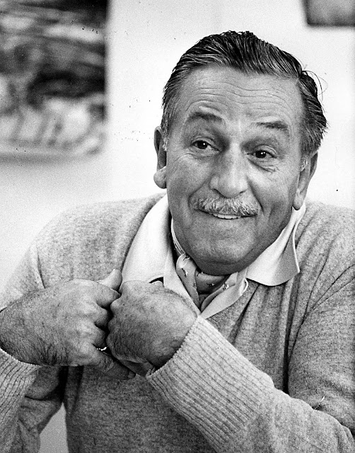
Walt Disney was a very driven, often impatient visionary, who changed the world.
I can't agree more with Floyd Norman's review of this film:

http://floydnormancom.squarespace.com/blog/2015/9/17/my-review-of-the-walt-disney-documentary


To many this was the last time TV audiences saw Walt, on New Years at the Rose Bowl in 1966.

Touch Up

$
0
0


Most everyone knows that the rough drawings done by Disney animators needed to go through a Clean Up process. The clean up assistant would take a new sheet of paper and trace the pose by applying a fine line.
But then there was Touch Up. If the character was drawn on model, meaning proportions and subtleties were close to the character's final design, no new sheet of paper was necessary. The assistant took an eraser and rubbed down loose construction lines, before adding tight outlines on the same sheet.
The drawings ended up looking clean, but the animator's underdrawing was still visible. Later the inkers ignored those loose, light lines and only traced the solid thin black lines on to cels.

The drawing above of the Queen from Snow White demonstrates this process. There are clean pencil lines defining the final appearance of the character, but you can still detect animator Art Babbitt's rough underdrawing. I would love to find out how Art drew the Queen before a touch up assistant got his hands on the scene.

Almost all of Milt Kahl's work was touched up, after all, he usually created the final look for most characters, in his own words: "I WAS the Disney style." This Alice drawing is from one of Milt's first scenes he did for the film, when Alice meets the Caterpillar.


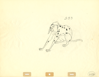
Years later, starting with 101 Dalmatians, those touched up drawings were not inked anymore, instead they were xeroxed on to cels. You can bet that Milt's drawings of Pongo stretching looked somewhat loser before being tied down b y an assistant.


A lot of Ollie Johnston's animation was touched up. Often Ollie would only use a blue pencil for his rough animation. The black pencil lines were added by his assistant. The work of Frank Thomas, John Lounsbery, Eric Larson an Woolie was often touched up, except for when the rough drawings needed to be brought on model.


1978 Thames TV Documentary

$
0
0


In the recent past I posted a few clips from this fascinating British documentary on Disney, which shows the company's history as well as what it was up to during the late 1970s.
Those clips were of inferior picture quality, and I am thrilled that John Canemaker informed me that the whole show can now be viewed on YouTube (in much better image quality).
Here are a few frame grabs that give you an idea of the top talents that were interviewed. Some of the comments, particularly by Kimball and Milt Kahl, are very candid, to a point that leaves me wondering: I can't believe they left this footage in the film!


Who knew that at one point in time Bernard and Bianca, seated on Orville the albatross, were flying by the Statue of Liberty ?


The studio gate the way I remember it. I rode through it (on a bicycle) in August of 1980 to start my training program with Eric Larson.


Here is the link to the film on YouTube:
https://www.youtube.com/watch?v=-2XEjVXMnhY


Lecture & Book Signing

$
0
0


Tomorrow, Saturday October 10, I will be at Van Eaton Galleries in Sherman Oaks, California. At 4:30 pm I'll start off with a one hour lecture on the work of Disney's Nine Old Men, which will include artwork, pencil tests and archival interviews. Afterwards I will sign copies of my new book. I understand there are still a few spots available. So if you are interested, here is the link to the event:


I am looking forward to seeing some of you there.

Peter Pan Stuff

$
0
0

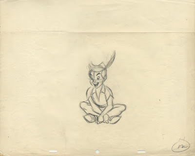
Nice production photo with sequence director Wilfred Jackson (next to a kneeling assistant) discussing a live action reference scene with actors Bobby Driscoll and Kathryn Beaumont.
You can see in the model sheets below, how much animator Milt Kahl modeled the appearance of Peter Pan after Driscoll.
Milt said once that the character of Peter Pan was interesting to him at first because of his weightless way of moving, but once he had that figured out he became a chore to animate almost like the Prince in Sleeping Beauty.
I sure wouldn't be able to tell from those gorgeous key poses on the model sheets.


A magazine article from 1953.
It's interesting to see how well the film stills hold up as black and white images. Perfect lighting and contrast.


A couple of iconic color images from the film.


The G#+x!! Prince

$
0
0


As I said before, Milt Kahl despised an assignment like a Prince character. As a young animator on Snow White he animated complex scenes involving all the forest animals surrounding the title character. "But I also got stuck with the clean up job on the Prince" he stated in an interview. The fact is that Milt drew over tracings of photo stats and therefor is credited with animating the Prince as well. In the drawing below Milt only focused on defining the Prince's head, the overall roto tracings were done by an assistant.


To  my knowledge, Milt had nothing to do with Prince Charming in Cinderella. He was animated by Eric Larson, who confessed to some of us newcomers that he felt kind of embarrassed about the stiffness in his performance.


Milt ended up designing Prince Phillip for Sleeping Beauty, and he animated all of his personality scenes. This prince had a little more screen time as well as potential for better acting than his predecessors. It is amazing to see how clean his "rough" animation drawings are. The cel inkers could have worked off Milt's fine lines, but the Disney system at that time still had clean up artists trace these already precise drawings on to a new sheet of paper.


The action scenes were handled by other animators like Ken Hultgren. But Milt felt he still needed a hand in the final depiction of Phillip, as the great drawing below demonstrates.


One of very few close up scenes given to Prince Phillip.


More on Prince Phillip here:

http://andreasdeja.blogspot.com/2012/04/no-carrots.html

How rough, how clean?

$
0
0


Young pencil animators often wonder about the nature of their drawing style. Am I drawing too clean, am I loosing life in my animation? Or do I draw too rough, does my work still communicate? Eric Larson told us way back the REAL answer has to do with clarity. Eric didn't care that much about your drawing style as long as you got across your ideas CLEARLY.
In other words, can an audience understand and appreciate your work?

Here is a look at vintage Disney examples that show a range of approaches.
In the early days at Disney a loose quality in drawing was encouraged by Walt himself, because it allowed the animators to work more spontaneously and intuitively. It seemed that loose drawings captured the spirit of life more than clean, tight renderings.
It's important to point out that vivid (even multiple) THIN lines were king, since the final representation of the characters would be done in one fine line, no THICK AND THIN.


There is looseness but great clarity in Fred Moore's work. A drawing like this one would be pretty easy to clean up. Look at how Fred treated Doc's pupils. they are outside the eye unit in order to exaggerate the upward eye direction.


A drawing from one of Milt Kahl's early experimental scenes for Pinocchio. All the body volumes are   drawn in a scribbly but perfect way. Only the hands might need a little investigation by an assistant.
In later years Milt would become obsessed with the depiction of hands.


A Frank Thomas rough of Pinoke just before he jumps into the ocean in search of  Monstro, the whale. The line work is similar to Milt's, loose, but controlled.


Preston Blair added shading to the belly of Fantasia's hippo. This made for a cool looking pencil test, but the darker tones would have to be be ignored by clean up and the inkers.


Beautiful rough of Rat from wind in the Willows. A very scribbly animation drawing by Milt Kahl, but a competent assistant shouldn't have any problems defining these lines in a clean way. The volumes are perfect in this strong pose, only a few details on his outfit need some attention.


Eric Larson animated this scene, in which Cinderella dreams about attending the royal ball. Working with live action reference can be tricky, but Eric always distilled a believable (graphic) performance from the footage.


During fast action scenes Milt would occasionally leave out facial details, knowing full well that his competent assistant could take care of those things.


This animation drawing (probably by Cliff Nordberg) shows some color pencil under drawing, but the final graphite lines are pretty exact.


A surprisingly clean rough by animator Woolie Reitherman. The acting is pretty broad here, but Woolie didn't leave anything to interpretation. By this time (the 1950s) animators knew that very rough drawings could lead to misinterpretation of their work by clean up artists.


Drawings like this one by Milt would not be redrawn, instead his assistant (on The Rescuers, Stan Green) would just erase construction lines, before the scene went straight to Xerox.


Eric Larson Art

$
0
0


It looks like Eric Larson is being handed what might be a ring from Disney Studio Chief Ron Miller to celebrate an anniversary during Eric's long career as an animator and teacher.
His first feature assignment on a feature film were those very labor intense scenes showing often large animal groups in Snow White.
It is interesting to see that in this drawing all animals are on the same sheet of paper. This means that none of the critters ever came to a stop (which would require a separate sheet to show them in a held position). But doing it like this certainly made it easier to orchestrate the overall motion of the group.


Scenes like this one -based on live action- needed to be scrutinized very carefully, or your characters would float on the screen. Look at how many times Eric altered the follow through on Cinderella's dress.


Great silhouette on these two rough drawings.


From one of my favorite sequences, Cinderella is pleading with the Stepmother, who is firing off orders and insults from her bed.


Eric animated many scenes during the opening sequence from Alice in Wonderland.


A couple of key drawings from a Peter Pan scene, in which Milt Kahl probably had a hand in as far as drawing the character on model.


This still is a publicity set up, but Eric did animate the complicated multiplane scenes featuring Peter Pan and The Darling children as they fly over London toward Neverland.


Peg became one of Eric's signature characters. A flawless performance in the Dog Pound sequence!


Some drawings come from Howard Lowery's auction website:

http://auction.howardlowery.com/Home.taf

Aladdin Buddies

$
0
0


Two friends of mine are currently part of the the enormously popular universe of Aladdin "On Stage".
Jonathan Freeman is the first and only actor who voiced a Disney animated villain and then went on to portray the role on stage.
I loooved animating to Jonathan's voice, and he is dynamite in the Broadway show. If you anywhere near New York, treat yourself to a fantastic evening.


John and Adam Jacobs (Aladdin) in rehearsal.

A different, non Disney production of Aladdin is happening right now in Paris. My friend Alexis Loizon plays the title character. Here is a group shot with the main cast, Alexis is the one with the six pac abs....in case you wondered.
Our Disney connection is actually Beauty and the Beast. Alexis played a forceful French Gaston in the Disney stage production of La Belle et La Bete.
I am thrilled that he will also appear in Disney's upcoming live action movie Beauty and the Beast, not as Gaston though. Stay tuned!


Alexis getting ready to hit the stage.


Goofy

$
0
0

Some fun Goofy material.
The beautiful watercolor illustrations above were published in Good Housekeeping Magazine.
The quality of the art in this page as well as in many other ones, based on Disney short films of the time, is outstanding. The characters were in their prime, in areas like animation, comics and illustration.

The following clean up drawings from the 1936 short Moving Day show animator Art Babbit's insight into the personality of Goofy. In this scene he is interacting with a piano which shows considerable personality. It refuses to get moved into the new home, and Goofy tries hard to meet this challenge.
No dialogue here just good old vaudeville pantomime. I wouldn't call these drawings refined or sophisticated, but the overall poses are very strong, and they communicate Goofy's state of mind in very entertaining ways.


A cel followed by a couple of rough animation drawings from the 1937 short Clock Cleaners.
It's interesting to see how loosely the animators worked when dealing with comedic action scenes.


A few pages from the How to Draw Goofy booklet, which used to be sold at Disneyland.


I never realized that Goofy had become a fashion trend setter. Those slipped down pants are back in style today.


I've always loved seeing sequential poses in Disney publications. What makes the Goofy run unusual and specific has to do with pose # 2. The knee moves way up with the foot dragging, toes pointing backwards, before snapping in to a forward position. This is an "out of the ordinary drawing" which breaks up the regularity of a normal run.


I had the pleasure of animating scenes involving Goofy for The Prince and the Pauper, and more recently for How to Hook up your Home Theatre, a short I am very fond of. It was always fun to get assigned to classic Disney short characters and try to give them a little Encore in life.

Some images, Heritage Auctions:
http://www.ha.com/c/search-results.zx?N=793+794+791+792+1893+1577+2088+0&chkNotSold=0&Ntk=SI_Titles&Nty=1&Ntt=animation+art&ic=homepage-search-071713

Jungle Book Thumbnails

$
0
0


I really don't know who drew these small thumbnail sketches for The Jungle Book. They might have been done for the original, darker story treatment, based on Bill Peet's concepts. The rhino Rocky shows up in one of the images, a character Milt Kahl was about to start animation on, before Walt suggested to remove Rocky from the film.
It is interesting to see how certain situations were either restaged or entirely cut from the final version while others reflect scenes we know from the movie.
These original pages were offered at auction a while ago, I kept scans of some of the sketches.
Beautiful stuff!


They Drew as they Pleased

$
0
0


You need to get this book!
Didier Ghez has compiled the most beautiful Visual Development artwork, representing the 1930s at Disney Studios. You will find gorgeous sketches, watercolors and pastels by artists like Albert Hurter, Ferdinand Hovarth, Gustaf Tenggren and Bianca Majolie. Their level of artistry and invention is mind boggling.
Today's animation industry can learn a lesson or two from the unconventional approach of these early Disney artists. These folks were feverishly experimenting, a quality I would like to see again in today's animated output.

Didier passionately chronicles the life and artistic style of Disney's early idea artists.
The illustrations are beautifully reproduced. Get the book!

http://www.amazon.com/They-Drew-Pleased-Hidden-Disneys/dp/1452137439/ref=zg_bsnr_tab_pd_mw_2


Here are a few of Hovarth's design concepts for various projects, not included in the book.


Drawings Disney/Heritage Auctions

Villains

$
0
0

If you'd ask me what Disney villain is the scariest, most evil, terrifying...my answer would be The Devil on Bald Mountain from Fantasia. Not much character development here, but a glorious  animated nightmare. Animation, effects, art direction...like Milt Kahl said:"There has never been anything like that since."


When it comes to villains in live action films, I can think of a few that scare the popcorn out of me.
Here are a few in no particular order of frightening degree.
Anthony Hopkins plays Dr. Hannibal Lecter so believably as a psychopath with cannibalistic habits, it's hard to look at the screen when he looking into the camera. This film frame alone...


Heath Ledger was so terrifying as the Joker in The Dark Knight, I went home after I saw the film and watches a sequence from The Aristocats (to calm down).


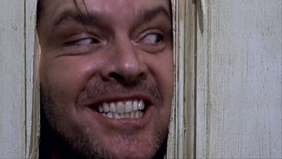
Jack Nicholson was made to play villains. He almost ended up voicing Hades for Disney's Hercules.
Talking about a gifted actor who has fun portraying evil.


Villains can be very good looking. It's a strange, but powerful concept.
Ralph Fiennes as Amon Goeth in Schindler's List.


Anthony Perkins in Hitchcock's Psycho.


Kathy Bates as the ultimate obsessed fan Annie Wilkes. Great film, difficult to watch.


I saw Clockwork Orange only once, will never watch it again. An amazing movie...too intense for me.
Actor Malcolm McDowell as Alex.


Movie bully #1, Zack Ward as Scut Farkus in A Christmas Story. One of my favorite films.


Another one of my favorite films, Spielberg's Jaws. Amazing script, actors, and the fact that you saw the shark only a few times helped elevate this film to classic status.
(Btw, right now we are having more sharks, Great Whites and Hammerheads, off the Southern California coast than ever before..scary stuff).


To me this character just might be the scariest of all screen villains. Actor Helgi Skulasson played a murderous tribe leader in the 1987 Norwegian film Pathfinder. This man has the look of death in his eyes. I apologize for the low res image, this is the only one I could find on the internet.
I really like the movie. Simple powerful story, great casting and....him!!


HAPPY HALLOWEEN!

Here is a link to a recent article about the villains I animated at Disney for Disney Insider:

Technicolor Flowers

$
0
0


The Flower Ballet from Fantasia's Nutcracker sequence has always been one of my favorite pieces of animation. What an unusual mix of effects and character animation.
The storyboard pastel sketches are breathtaking as well. I wished I knew who drew them.


Images: Heritage and Bonhams Auctions

Before Ever After

$
0
0


If you -like me- ever wondered how on earth Walt Disney's artists reached such astronomical artistic heights, you will find some answers to that question in this new book.
The short and feature films during Disney's Golden Age didn't just happen because the staff was talented and could draw and paint well. At that time there was a serious program in place which involved drawing classes as well as lectures with topics such as acting, architecture, color theory, caricature and anatomy to name just a few.
The best authorities and teachers in these fields stopped by the studio to give an insightful talk or they  were put on staff and taught on an ongoing basis.
Luckily these lectures were transcribed back then, and thanks to Don Hahn and Tracey Miller-Zarneke, who spent a considerable amount of time searching for these treasured documents, we now can all relive and learn from Walt Disney's art training program.


This is a big book, 448 pages full of photos, sketches and reproductions of those vintage pages, which reveal words of wisdom by in-house artists like Bill Tytla, Don Graham, Ham Luske and many others.
Visiting artists include architect Frank Lloyd Wright, painter Jean Charlot and color expert Faber Birren.


One of the most import and and inspiring books on animation ever published:

http://www.amazon.com/gp/product/1484710819/ref=s9_simh_gw_p14_d0_i1?pf_rd_m=ATVPDKIKX0DER&pf_rd_s=desktop-1&pf_rd_r=1QC90QBHM6G035M7APS9&pf_rd_t=36701&pf_rd_p=2253014322&pf_rd_i=desktop


Aristocats Stuff

$
0
0


I really like Ken Anderson's Vis Dev work for The Aristocats. Frank Thomas felt that Ken's work lost strength after his stroke in the early 1960s, but to me his art certainly never lost any charm. Just look at this sweat color gag sketch featuring Marie.


I don't know who the artist is behind this sketch, but I do love the atmosphere and staging.


 A couple of Anderson gag drawings showing that the kittens are spoiled and have the run of the house.


Development art by various artists for Duchesse, who was voiced by Eva Gabor.


Madame Bonfamille, animated by Milt Kahl, is a favorite of mine. She is a realistic, straight character,  brought to life by Milt Kahl with extraordinary nuanced performances and drawn absolutely beautifully. The character was voiced by British actress Hermione Baddeley, who had played a maid in Mary Poppins.

Viewing all 1315 articles
Browse latest View live