Quantcast
Channel: Deja View
Viewing all 1315 articles
Browse latest View live

Talking Flowers

$
0
0

The flowers in Disney's Alice in Wonderland have attitude issues. Friendly at first when a downsized Alice approaches them, but then their demeanor turns hostile. Alice is even called a weed.
This is wonderful personality stuff. Anthropomorphic flowers with definitive character traits. I just love the way blossoms become faces and leaves turn into arms. John Lounsbery animated lot of the flower scenes.

Mary Blair did a ton of color/design studies, all of them stunning. The Technicolor process allowed for an extremely vibrant color palette on the screen.

This post is dedicated to my friend Guillaume, who wanted to become a florist after watching this sequence from Alice in Wonderland as a kid. As a matter of fact, today Guillaume is a highly successful florist in Paris. His work is as beautiful as the images you see here.


Grand Design

$
0
0

A gorgeous color sketch of the Lackey from the film Sleeping Beauty by Milt Kahl. I love the contrast  within the shape arrangements. Bulky body on very skinny legs. Milt went even further when he drew the Prince's horse Samson. His lower legs come together to almost one thin line.
The Lackey's outfit shows detailed patterns here, which were simplified for the final model design.
This is something CG can do very easily and successfully, lots of realistic detail. Hair, fur and patterns. 
But this is graphic animation, and the idea is to boil things down to an essence. The balance between round and square shapes in this drawing is masterful. The overall color choices are pretty stunning as well.
My next post will demonstrate some of Fred Moore's design principles.

Grand Design II

$
0
0

Fred Moore drew this pose of the dwarf Happy twice. First as a lively intuitive rough, then as a tie down. What I love so much about this drawing is that it shows Fred's natural sense for interesting design combined with a great feeling for personality.
Happy's waistline is set extremely high up, so the viewer can appreciate the full size of his belly.
Lots of line work on the upper body, combined with bold simplicity on his lower body. This creates contrast, the shapes show a great deal of variety. It always bugs me when a character drawing is made up of evenly sized, similar shapes.


Look at how boring the pose would have been with the waistline drawn right in the middle of the figure.


If you'd place the waistline lower, you get the contrast back, but since Happy's body is arching backward, it makes much more sense to design the pose the way Fred did.


World Lion Day

$
0
0

August 10 is World Lion Day.
In light of the recent horrific events surrounding Zimbabwe's lion Cecil, it is important to reflect on these magnificent animals...and their dwindling numbers in the wild. If you want to help, here are links to a couple of reputable organizations who are making a difference in preserving precious wildlife:

http://worldlionday.com

http://gifts.worldwildlife.org/gift-center/gifts/Species-Adoptions/Lion.aspx

Let me tell you, there is nothing more satisfying than having your own art show and donating the proceeds to animal conservation efforts. I have done it, I highly recommend it.

Which brings me back to The Lion King. I remember animating this scene during Scar's introduction.
"Life's not fair, is it? You see I...well I shall never be king. And you...shall never see the light of another day!"
This wasn't my first scene with Scar, I had done a few walks and very short dialogue scenes. But when animating this moment I started to feel the potential for the character. The mouse was beautifully animated by Brian Ferguson.


But my very first scene for The Lion King was this one. A Black Rhino rising early in the morning. I remember it like yesterday, the directors told me: "Now Andreas, this is the very first animation in the film. People will judge - is this going to be a good film or not?" Talking about pressure.
I ended up animating the scene about seven or eight different ways. Nothing seemed right to the directors.
I had the rhino lift up the head in perspective, in profile, different types of timing...etc. The final verdict was: "Well, I guess this will do."
Oh brother...I thought. Am I going to have fun animating on this movie?
Did I ever. Those were just early jitters. Scar remains one of my favorite animation assignments.


D23

Disney Mix II

$
0
0

You can find great Disney art within many stages of film production. This color sketch by Mary Blair for Alice in Wonderland is amazing to me. She uses the most intense red as the main backdrop without making it look garish. Unbelievable!


I love this publicity drawing for the short film The Whalers. The basic staging element is a dynamic triangle. Donald's and Mickey's attitudes are as usual opposite. What beautiful poses on the characters, and what great inking!


A spooky mood study for Night on Bald Mountain. Twisted perspective and eerie lighting result in a nightmarish atmosphere.


A charming pen/ink/watercolor study by Mel Shaw for The Fox and the Hound. Looking at it, the overall style is somewhat like my film Mushka. Sketchy, lots of white and selective color.


A beautiful record cover for Cinderella, inspired if not painted by Mary Blair.
Perfect color choices!


Art Deco in motion. A film frame from the end of the Pastoral sequence. Pure elegance!

Albert Hurter's studies show the interaction between Snow White and the Huntsman. These early drawings already show attitudes and acting.


What a brilliant concept for a candle holder. The poor guy is definitely concerned about the approaching flame over his head. A prop study for Pinocchio.


And because we love her so much, another Mary Blair concept piece for Alice in Wonderland.
Wonderful scale, helped by the tiny cow and Alice's head covered by half a tree.

Wart as a Sparrow

$
0
0

In this scene Wart (as a sparrow) seems for a moment smitten with Madame Mim (as a beautiful Girl). Why Mim looks like a younger version of Madame Medusa here becomes clear when you consider that Milt Kahl designed and animated  both ladies.
He also set the final look for Wart (as a human as well as a sparrow.)

Here are a couple of wonderful, rough doodle sheets, which the ink & paint department used for early color model ideas.


More on Wart's original design in this earlier post:

http://andreasdeja.blogspot.com/2013/10/wart.html

Coming to a Bookshelf near You...

$
0
0

...toward the end of next month:
- Hardcover, almost 400 pages
- Hundreds of drawings by the Nine Old Men, most of them never published before
- Insight into their creative process
- Stories about their artistic triumphs as well as occasional failures and disappointments
- Profiles of each animator's career achievements
- and much more...

It turned out to be the kind of book I wished I had when I was an art student.
Preorder it from Amazon, you'll have an early Christmas:

http://www.amazon.com/gp/product/0415843359?refRID=FMQBBQ9J0QDNN0P9YEV2&ref_=pd_rhf_pe_p_img_1


Ruthie Thompson

$
0
0

During the Legends Lunch a little over a couple of weeks ago I was happy to see a true Disney Legend, Ruthie Thompson. The first time I met Ruthie was five years ago, when she visited Disney Animation Studios, she had then just celebrated her 100th birthday. She truly validates the notion that most animation artists enjoy a long life. In this photo you are looking at a vivacious lady at 105.
Ruthie started at Disney in the Ink & Paint department during the production of Snow White. About a decade later she transferred to animation checking and scene planning, a department she would later supervise. Scene planning was very much involved in the technical aspects of multiplane scenes such as the flight over London in Peter Pan.
A while back I asked her what one one of her most challenging assignments might have been. She paused for a second and and said that the opening scene from Sleeping Beauty took a lot of brain work, since there were endless characters involved on endless cel levels.

How can you not love Ruthie Thompson ?!


Here is a link to a recent Vanity Fair article, featuring Ruthie and other Ink & Paint artists:

http://www.vanityfair.com/culture/2010/03/disney-animation-girls-201003

Louis Prima

$
0
0


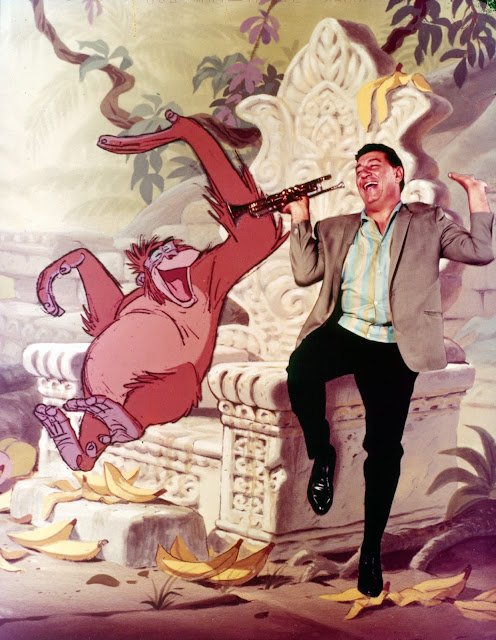
What a great photo montage with King Louie next to jazz musician and trumpeter extraordinaire Louis Prima, who also voiced the character. The Sherman brothers wrote the signature song "I wanna be like you!", and Richard Sherman still raves about Prima's vocal energy and improvisational quality he brought to the character and the song. The "scat dialogue" between him and Phil Harris as Baloo was Prima's idea.
If I would look at a concept like this one today, mixing American Jazz with (elements of) Kipling's Jungle Book, I would probably call it a bad idea. But boy...it works like gangbusters!


Hilarious concept sketches by Ken Anderson and a cel from a Frank Thomas scene.


Milt Kahl's early stunning animation. Yet Walt Disney asked for slightly larger eyes and more hair on the top of the character's head. Those changes were made by Milt's assistant Dave Michener.


A clean up model sheet of Louie's sidekick Flunkey, beautifully animated by Frank Thomas.

More on King Louie here:


Tease 2

$
0
0

This gorgeous Merryweather scene by Frank Thomas will be part of my book on The Nine Old Men. The most important key drawings will be shown in sequence.

Jungle Book Layout/Background

$
0
0

This has always been fascinating to me: The relationship between Disney layouts and final backgrounds. It is interesting to see what the background painter changed from working with the layout. For example, the layout above from The Jungle Book suggests a dark, cloudy sky, a storm might be approaching. The BG shows sunlight, mid day.
Comparing the two, I would say that I prefer the dark foreground level of vines and branches in the layout. The highlights in the final painting compromise the depth of field.
I wonder how much Disney's layout and background artists used to argue over color, contrast, light etc. 


Jungle Book Layout/Background II

$
0
0

In this photo Disney background artists Al Dempster, Bill Layne and Art Riley are examining character color model cels and background paintings for The Jungle Book.
You can see that early edgier work by Walt Peregoy has given way to a more realistic, romantic interpretation of the Indian Jungle. I believe at this stage of production Baloo was painted as a brown bear, before Walt Disney asked for a different color (there had been plenty of brown bears in Disney films before.) Since Walt was no fan of the Xerox line, particularly in the backgrounds, he requested a less graphic and a more painterly approach toward the film's art direction.

A B&W still from the title sequence. Fantastic use of light.


Mowgli  walks through this setting  after parting ways with Bagheera, the panther.


It's interesting to see that the painters found it necessary to add black contours to background elements that would be in contact with a character. Bagheera walks over this branch, and since his outlines are black Xerox, character and background become a little more unified.


I've always liked the color mood in this scene by Ollie Johnston. Look at how Mowgli's red shorts pop in front of the lush green tones.
A German journalist once told me that part of the reason why Jungle Book was his favorite animated film was the fact that you spend over an hour in a richly painted exotic jungle. Very easy on the eyes.


Tease 3

$
0
0

I will be discussing this Maleficent scene by Marc Davis in my upcoming book The Nine Old Men.
Most key drawings will be shown in sequence. It is interesting to see how rough this scene is drawn, compared to Marc's drawing approach in his earlier work on the character, which is very clean and tied down. My guess is that by this time in production his clean up crew had become very familiar with the character, allowing Marc to draw loose and get through his scenes quicker.
Evil power combined with sophisticated elegance!

More Liu Jiyou

$
0
0


These stunning paintings appear in a book on Chinese painters, which I recently purchased.
Beautiful brushwork and gorgeous watercolor textures. Liu Jiyou studied Western painting and incorporated its realism into his own work. His art is bold and delicate at the same time.
How about an animated film in this style? Now that would be something!!


More on Liu Jiyou's art here in these previous posts:


Tease 4

$
0
0

One of Madame Mim's best acting moments, and one of my favorite Frank Thomas scenes.
The witch is setting the rules for the wizard's duel against Merlin: "(Rule one: no mineral or vegetable!) Only animal. Rule two: No make believe things like, oh...pink dragons and stuff. Now..."
Quite a while ago rough drawings from this scene were offered for sale all over the place. It took me years to collect most of the important ones, which can all be seen in sequence in my upcoming book on Disney's Nine Old Men.
This scene showcases yet again Frank's virtuosity as an actor. Mim first gets into a thinking pose, as she dreams up the next rule. Wild gesturing follows, emphasizing the "outrageous" idea of turning into a pink dragon.
This is the kind of work that still awes me and inspires me.

Pinocchio Premiere

$
0
0


It is a mystery to me why Disney's Pinocchio wasn't as big of a box office hit (in its first release), if not bigger, than Snow White had been. The film deserved that. So it wasn't a romantic love story, but just like its preceding feature film, there is so much depth, darkness as well as happiness in Pinocchio. Every single character is interesting, and there are sequences even Hitchcock couldn't have imagined. Luckily time has been very kind to this cinematic masterpiece, and today it ranks as one of the greatest films of all time.
Pinocchio premiered at the Center Theatre in New York on February 7, 1940.


The theater's lobby showcased a full scale exhibition on the making of the film.


A magazine article which focuses on the movie's voice talents.


A gorgeous background painting from the film's opening sequence. I don't know if this is a study or the final BG, but watercolor application and lighting are astonishing.


Look who seems to be lost in the crowd at Pinocchio's premiere in the lobby of the Center Theatre!


Tease 5

$
0
0

Milt Kahl was a junior animator in his 20s when he animated this scene with a dove "delivering" a kiss from Snow White to the Prince. I find this key drawing simply stunning.
It shows that Milt was already a master of staging a situation (as well as a master of drawing hands).
The bashful tilt of the dove's head is PERFECT! In the hands of a lesser artist, this moment could have been a B continuity scene, instead it turned pout to be an A+.
A lot of dedication and love in this drawing.

It appears in my book on Disney's Nine Old Men.


Smee in Trouble

$
0
0


A photostat of actors as pirates, as they go through the motions of threatening Smee. As the sequence's story goes, they feel they are wasting their time near the island and would rather set sail to find ships to loot.
The brilliant animation in the film by Ollie Johnston shows that ideas of this live action reference could be adopted, but needed to be re-staged and pushed for cartoonier staging and acting.


It's unbelievable to see how far Ollie went to portray Smee's anxiety, having the pirate's saber  getting closer and closer. Completely unrealistic animation, but you sure feel his jitters. Great scene!
(I had originally planed to show key drawing from this scene in my book, but we ran out of room.)


Smee's body is basically a water ballon, resulting in extreme squash and stretch animation.


Great facial reaction on Smee as the blade approaches his neck. These emotions are entertaining, but they also ring true.  Most people would put on a similar expression being caught in a predicament such as this one.

Effects Animation

$
0
0


There are times when I want to make the switch from character to effects animation...at least for a little while. Effects animators are not concerned with the often intense analysis of character development and acting. Their world has to do with mood, interpreting nature and inventing surreal imagery. This sounds so much easier than dissecting movements of human and animal characters. But I know that this is not the case. Just look at these concept sketches for The Sorcerer's Apprentice. How do you create these stunning visuals in motion? It represents a challenge as difficult as animated character acting, particularly if you want to be inventive and find new ways of presenting effects.


Whenever rough effects were needed to present a convincing character animation pencil test, I really enjoyed animating water, shadows, dust etc. And I got a big kick out of finding out that often (not always) the effects animators kept the essence of my rough effects work.
One of my future projects include a short film that combines music and abstract animation.

The following magazine article shows how inventive Walt Disney Productions proved to be time and again not only in regards to animated imagery but sound as well.


Viewing all 1315 articles
Browse latest View live