Quantcast
Channel: Deja View
Viewing all 1315 articles
Browse latest View live

The Queen of Hearts, from Mary to Frank

$
0
0

 I have always loved Mary Blair's depictions of the Queen of Hearts for the film Alice in Wonderland.
A grotesque, brash, bossy and even dangerous monarch. Because of her stylized pre production imagery Mary went all out to portray this eccentric Queen with broad but effective brushstrokes.
ans as usual, her color choices for the character's environments were brilliant.
To quote Marc Davis: " Mary knew color better than Matisse." She had a way of putting colors together that surprised everybody, colors that you thought wouldn't work together.


Animator Frank Thomas took some of Mary's ideas, but transformed the character into a slightly more dimensional universe, in order to fit with the rest of the  cast. The essence of the Queen's personality remained the same, Frank just needed a bit more realism to portray her over the top performances in a believable way.
To me both graphic approaches helped to define this villainess and helped to establish her overbearing, but funny character traits.


A rough animated scene with the queen of Hearts showcasing an abrupt emotional outburst is featured in my new book on The Nine Old Men.


Kaa

$
0
0


Milt Kahl is showing some guests the scene he is working on for The Jungle Book. Kaa, the python, has a strangle hold on Mowgli and is about to devour him. Luckily Bagheera, the panther, interrupts the situation just in time.
Kaa is a fascinating character. I will never be able to figure out how Walt Disney thought that the voice of Winnie the Pooh would be perfect for a villainous snake as well. I suppose actor Sterling Holloway was able to slip into just about any role and be convincing.
What's also interesting about Kaa is the fact that the snake's design changed. In this early sequence the eyes are smaller and are drawn streamlined on top of the head.


When Kaa returns later on in the movie, the snout is larger, and so are the eyes. These are Milt's drawings as well. Unfortunately I never thought of asking him about the subtle change in design .


Going back, here is the starting point in terms of design, a story sketch by Bill Peet.


According to Frank and Ollie's book The Illusion of Life several artists contributed to the visual development of the snake. I recognize Ken Anderson and Milt at the very end.


More of Milt's drawings. What a great rough sketch with Kaa and Mowgli.


Frank Thomas animated the later sequence, when Kaa tries again to hypnotize Mowgli in hopes for a meal. Shere Khan interrogating the snake is of course Milt's sequence.


Story sketches by Vance Gerry with the help of Floyd Norman, a new and upcoming story artist.
The central color sketch is by Ken Anderson.

A Frank Thomas rough animation drawing. Mowgli tries to free himself from Kaa's body.


As all characters in The Jungle Book, their acting and relationships to other personalities is what makes the film. So little story, but sooo many entertaining situations. Still my favorite. 


A Moment of Truth

$
0
0


I left Walt Disney Animation exactly five years ago.
This moment makes me reflect on my early days at the studio, which was then called Walt Disney Productions. You can't tell from the photo (taken by Hans Bacher), but I was thrilled beyond belief that Disney had actually hired me. We were still working in Walt's original Burbank Studio, and even though retired, most of the Nine Old Men were still around. They would come in for the occasional lecture, Eric Larson still worked on a daily basis as head of the training program.
Believe me, I knew I was one lucky guy. I remember Christmas time at the studio. Before our holiday break, there was an impromptu eggnog gathering in layout artist Don Griffith's office. Woolie Reitherman stopped by, as well as Art Stevens and other senior artists.

The photo shows a guy who really didn't know what he was doing at the time. But as I mentioned, I was super excited.


That's my buddy Phil Nibbelink, who along with layout artist Guy Vasilovich created one of the best sequences in the film, when the Gwythaint monsters kidnap the pig Hen Wen.


The movie did have some fantastic special effects. That particular unit did not show the inexperience evident in the the work by the character animators.


So here it is, the final footage chart. I had been on the film longer than most animators and ended up doing a chunk of work. No wonder management was kind to me. 
So whatever you don't like about The Black Cauldron, I probably have something to do with. All I can say is that this was my "learning" project, I made a lot of mistakes, but by the end of production I felt like I was able to take baby steps as far as animating. 


The numbers indicate feet of film. One foot and a half is ONE second of film.

Stepmother Reference

$
0
0
I am always fascinated to find out how Disney animators used live action reference for their animated scenes. Fascinating as well is to see what went on during the filming of the live action. What kind of effort was put in to simulate the animated performance. As you can see in this photostat, actress Eleanor Audley's outfit doesn't exactly match the costume design from the final frame, but it is close enough for study. Animator Frank Thomas changed the bent of the arm pulling the tray, perhaps to better emphasize the sleeves weight. Because of the cat's position, her right arm needed to be staged differently.
I do like the downward head tilt in the photo, I am not sure if Frank took advantage of this in a different frame of his animation.
Eleanor Audley's make up is of interest as well. Slightly overdone, but very graphic as far as eyebrows, eye liner and lipstick. This helped the animator to read facial expressions more clearly.

I think I mentioned before that this sequence is one of my favorites in Disney animation, even though it might look "live actiony" to some viewers. Eric Larson animated Cinderella here, as she is being verbally abused by her stepmother. Staging and lighting is pure Hitchcock. The animation is subtle, to the point,  and it defines the relationship between these two adversaries in a powerful way.


Fritz Hug Prints

$
0
0


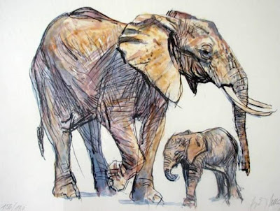
More art from Swiss animal artist extraordinaire, Fritz Hug. I love his stuff.
His compositions are always great, and each sketch or illustration showcases a pose that is so typical and unique for this particular animal. Look at the skin flap on these elephants that starts at the knee and stretches all the way to the rib cage. Amazing observation.
Most of these drawings are actually high end prints offered on ebay. They are not cheap for a good reason, this guy is amazing!
He always pushes the contrast between thick and thin body parts, but more importantly, his love for all animals comes through in every image.


Here is the link to my first post on Fritz Hug, but if you type his name on my blog search, there is plenty more:

http://andreasdeja.blogspot.com/2011/11/fritz-hug.html


Brian Bedford

$
0
0


Tony award winning actor Brian Bedford, who provided the voice for Disney's Robin Hood has died.
Bedford was a classical Tony award winning actor, who performed on stages in the UK, the US and Canada. His film roles include The Grand Prix, 1966, and Nixon, 1995.
A few years ago, during an interview, he admitted that to audiences he is mostly known for Robin Hood.
Milt Kahl, who struggled with the design for the character, nevertheless liked the debonair quality in Bedford's voice. (The studio originally had cast Tommy Steele for the part, but for some reason it didn't work out.)
Someone tweeted today about Robin Hood: The only cartoon character many people admit to having a crush on.
I so wished Milt was still alive to comment on this phenomenon. I can hear his boisterous laugh.
But when you think of it, what an achievement...

This scene shows an early, long nosed version of the character. Only a few scenes like this one were re-drawn and altered to represent a shorter nosed fox. But as usual, Milt's strive for superior graphic design is incredible. The way paws function as hands, the feeling for loose fabric and the ability to draw the head from any angle beautifully.
This is part one of a long scene. Robin is reacting to a comment from Little John: Why don't you stop moaning and moping around...just marry the girl!
His response in this scene:
Marry her? You just don't walk up to a girl, hand her a bouquet and say: Hey, remember me, we were kids together, will you marry me? No...it just isn't done that way.

I'll post the rest of the scene if you are interested.


Here are some of Milt's thumbnail sketches in preparation for the scene


If you'd like to see Milt talk about Robin Hood, go to this previous post, which includes a strange interview.

http://andreasdeja.blogspot.com/2012/11/milt-kahl-talks-robin-hood.html

Robin Hood Scene II

$
0
0
Here is part two of Milt Kahl's Robin Hood scene, which required many key drawings. Lots going on, there is a walk, and the acting is very lively. The more motion on the screen, the more drawings the animator needs to put in.
Part III to follow.


Robin Hood Scene III

$
0
0
Here is the final part of Milt's Robin Hood scene, in which the fox first acts out a proposal for Maid Marian, before admitting that "it just isn't done that way".
I don't know why Milt's timing charts are left out on these copies of his roughs.


Study by Marc Davis

$
0
0


Marc Davis drew this study of a young woman in a reflective mood when he was twenty-eight years old. The US had just entered WW II, and perhaps she is thinking about her boyfriend or husband, who was sent overseas as a soldier.
The context of that time and the overall mood tells me this kind of a story, but it's just a guess.
Walt Disney sure employed some remarkable artists like Marc, who helped to transcend early animation into the art form we know today.
I really like this drawing!

More Book Ideas

$
0
0


I really enjoyed working with Focal Press (Taylor & Francis) on my Nine Old Men book. I was thrilled to find out about the generous page count of 400. And after discussing a unique kind of layout, designer Alex Lazarou did such a beautiful job with the look of each page.
There was one aspect that frustrated me though, because I wanted to include so much more animation art such as key drawings from the amazing John Lounsbery scene, pictured above. 400 pages is a lot...but there is so much more great stuff to share.

So here is my plan for the future:
After completion of my film Mushka, I will try to get a book published with more Disney animation art, but not only by the Nine Old Men. Work by Fred Moore, Tytla and others would also be included.
Lots of pictures, very little text.
I do believe one single oversized book just on Milt Kahl's work is overdue. There are so many of his rough drawings that have never been published before and need to be made available to whoever is fascinated by his art. This volume should also include photos showing Milt at work through the years.

I hope you like the idea for these two books. As I see it, we can't have enough classic Disney art to study and to be inspired by.

Looking back at the drawing with Tony and Joe from Lady & the Tramp, if this does't make you want to draw and animate, nothing will.

Mel Shaw at the Walt Disney Family Museum

$
0
0


A terrific exhibition opened a few days ago at the Walt Disney Family Museum in San Francisco.
Mel Shaw: Animator on Horseback will run until Sept. 12, 2016.
It is crazy to find out that Mel never had an exhibition during his lifetime, so this show is a first.
Don Hahn curated this beautiful exhibit which features examples of Mel's Disney concept art, and lots of his personal work. There are travel sketchbooks and paintings depicting California History, the Old West and many equestrian themes. Mel loved horses and he was an expert in horse anatomy and movement.
In case you didn't know, he was also an amazing sculptor. Several bronzes are on display.


A watercolor sketch of Bambi encountering a cricket.


Entering the imaginary world of Heinrich Kley, a group of centaurs playing polo.


No, this is not a Fox & the Hound production painting. It is a scene from one of Aesop's Fables.
I believe a non Disney piece of art.


A simple, but beautiful sketch, made during one of Mel's trips to Africa.


Most of you will recall this scene from Beauty and the Beast. I remember as if it was yesterday, Mel just knocked out these gorgeous storytelling pastels, one more beautiful than the other. The unproduced Musicana, The Black Cauldron, The Great Mouse Detective, Beauty & the Beast and The Lion King, all benefited greatly from from Mel's inspirational work for these films.

Here is the link to the Museum's web page:
http://waltdisney.org/exhibitions/mel-shaw-animator-horseback

More on Mel Shaw in this previous post:
http://andreasdeja.blogspot.com/2013/06/mel-shaws-beauty-beast.html


Fantasia Art

$
0
0

Development Art for Fantasia, done in a variety of techniques, amazes me. These artists were thinking outside of the box, they were doing stuff never attempted before. And they were thinking BIG. Classical music, abstractions, a poem by Goethe, the creation of the earth and Walpurgis Night among other themes. Fearless!


Mary Costa

$
0
0


Disney background painter and imagineer Frank Armitage died recently at the age of 91. I remember meeting him briefly once or twice when still working at Disney. He was soft-spoken, and like all of the old-timers had high standards and was judgmental for all the right reasons.
There were several reports in the media, most write ups focused on his contributions to Sleeping Beauty and his work for Imagineering. A few wonderful photos, taken during production of SleepingBeauty, accompanied the tributes. I am re-posting them here.
Mary Costa is a living Legend in the truest sense of the word. First of all she defies nature by looking decades younger than her actual age. I have had the pleasure of spending time with her on several social occasions. She is as lovely as you might imagine, and as the voice of Aurora,  Mary exuberates a passion for life. For those of you who don't know, Mary has has had a prodigious career as an internationally celebrated opera singer.
She talks about having to loose her southern accent for her role in Sleeping Beauty, and that she gets a kick out of the character of Charlette in The Princess and the Frog, since they are both Southern Belles.
Look at these fascinating photos, they take you back to the late 1950s at Disney in HD.


I like this illustration, which appeared on some of the film's posters, and was also used as a record cover for the movies's songs and score. 


The film's program from 1959. It includes most of the credits.


A pic from just a few years ago with friends at the Tam O 'Shanter, an LA  restaurant Walt Disney and staff used to patronize. Walt's table is still kept in the same place.
Mary, me, Kathryn Beaumont Levine, Richard  and Elisabeth Sherman and Alice Davis.
And yes, I was pinching myself, Disney Royalty all around.


Lady & the Tramp Art

$
0
0


An animation colleague of mine said this about the film Lady & the Tramp: "Oh, it's just a soup opera with dogs. Boy gets girl, boy looses girl, boy gets girl in the end."
Be that as it may, I think the movie's story is compelling and in support of rich characters. I remember listening to a Walt Disney interview, in which he said this about the film: "Lady & the Tramp turned out well. We felt it, we felt the personalities."
Milt Kahl was equally fond of the film: "L & T is a good movie, I did a lot (of animation) in that. Of course the best thing in it is Eric Larson's dog, the one with the Veronica Lake hairdo...I forget her name now."
Publicity illustrations like the one above are a hit and miss, when it comes to Disney advertising art. Fully rendered, painterly versions of the characters can look cheesy when in the hands if the wrong artist. But this one is on model, and the dogs' fur is skillfully rendered. It looks charming.

Frank Thomas roughed out this composition of Lady and Jock, as they react to Tramp's presence. Their emotions couldn't be more different: Jock is annoyed with the intruder, while Lady is still reflecting on the way she was treated by Mrs Darling.
On the surface this is a very sketchy drawing, but it is very clear nonetheless. Frank's feelings on paper.


This cel represents an early version of Lady's facial appearance. Her eyes are surrounded by a lightly painted area, which was dropped for the final version. (I do recall seeing this scene as a stand out in a screening of the film way back.)


The corrected version as seen in most prints of the film.


Milt Kahl took "realistic" squash and stretch to a whole new level when he animated dialogue scenes with Trusty. His huge muzzle gave Milt the opportunity to exaggerate follow through motion as well.
You can tell, he had a ball animating this character.


Joe Grant came up with this intriguing sketch, depicting Lady and the film's evil cats Si and Am.


These cats presented a real design/animation problem. Ward Kimball started animation, but the footage turned out too zany for the film's style. Milt Kahl reset the felines' design, and animators like John Sibley, Bill Justice and Bob Carlson took care of the final animation.


A clean up model sheet of Peg (whose name escaped Milt), comprised of drawings by then clean up artist Burny Mattinson.


Animator  Ed Aardal had his hands full animating this action scene toward the end of he film. Realistic horses freaking out, beautifully executed.


A color study for the romantic sequence by Eyvind Earle.


And a gorgeous background from the opening sequence, I believe painted by Claude Coats.
Movies like Lady & the Tamp seem to age beautifully, there is a degree of love and dedication missing from today's animated output.


Previous posts you might like about Lady & the Tramp:


Some Images Heritage Auctions, Howard Lowery


Clock Cleaners

$
0
0


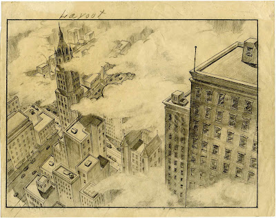
Clock Cleaners from 1937 is one of my favorite Disney shorts. The story provides plenty of great gags, and the character animation is incredible. The layouts involve dramatic down shots, which can leave you with a fear for heights.
I remember that as a kid I had a shortened Super-8 film copy of the film, and during a home screening my father mentioned that several shots made him feel dizzy.

These beautiful cels show their age and some damage, but it amazes me they survived at all after so many decades. Look at those colors!
Heritage Auctions offered these treasures a while ago.

What never fails to impress me is that the world these cartoon characters inhabited was logically and realistically depicted. The backgrounds are believable renderings of skyscrapers.
For some reason more recent version of a "cartoon" world, wether Toon Town or TV episodes featuring cartoony characters all show wacky perspectives, crooked buildings, horizon lines that make no sense etc.
The reason my dad felt dizzy watching Clock Cleaners is due to the fact that Disney's worlds might be fantasy, but they sure have a way of getting you involved, acrophobia and all.


Check out this previously posted interview with Clock Cleaners layout artist Ken O'Connor about cheating perspective to get a certain effect across:


Madame Medusa Outtakes

$
0
0


These unfinished Medusa drawings by Milt Kahl were a Christmas gift to myself. Heritage Auctions offered them recently, and there are certain things ...you just have to have.
It doesn't get any better than this: Milt Kahl's rough thoughts on paper. Sharp, thin pencil lines searching for the best way to express the character's emotions. What's crazy about Milt's rough pass at a scene is the fact that he defines certain things very roughly and others extremely delicately, in the same drawing!!
And the pencil just seems to dance on the surface of the sheet of paper.
A once in a century kind of talent!


More Medusa roughs here:

http://andreasdeja.blogspot.com/2013/03/happy-birthday-milt-kahl.html

and here:

http://andreasdeja.blogspot.com/2011/11/madame-medusa.html

A Blast from the Past

$
0
0


I was surprised to see some of my earliest character designs for The Black Cauldron being offered at Van Eaton Galleries. I haven't seen these sketches since I made them, around 1981.
Boy, if this doesn't take me back to my early days at Disney. I loved working with felt pen and magic marker colors.
Other things come to mind: LA was very smoggy in those days during summer, my English wasn't very good,  and I rode a bicycle to the studio from my apartment in North Hollywood. (Didn't have a driver's license yet.) I remember ignoring a traffic light and making a swift right turn on my bike from Magnolia Blvd. on to Buena Vista St. without stopping. A policeman saw this and yelled after me. I thought, this is it, I am going to get deported.
Funny, the things you remember..


Here is the link to Van Eaton Galleries:

http://www.vegalleries.com/newart.html

Saludos Amigos

$
0
0


This month seventy-three years ago Disney's Saludos Amigos premiered. Two years later in 1945 the second of the South American features The Three Caballeros opened.
Frank Thomas was the only animator who travelled with Walt Disney and other artist, known as El Groupo, to several South American countries in order to study and sketch local folklore.
Frank drew this early design for a feature then named Carioca Cocktail 1941, featuring an armadillo and a monkey, characters that didn't make it into the final film.


James Bodrero's sketches for the El Goucho Goofy section were used as publicity material for the film. I love these, Bodrero's work has so much life.


 Woolie Reitherman animated most of the footage with Goofy and the horse. Look at the insane detail on both characters. We are talking twenty-four of such drawings per second!!
And Woolie really worked the positions over and over to achieve just what he wanted to see on the screen.


Beautiful character and background studies for the Pedro section.


Another scene that does not appear in the film.


A great page for the magazine Good Housekeeping. Beautifully drawn and staged, based on Milt Kahl's animation for the Lake Titicaca section.


An early concept drawing of Jose Carioca by Herb Ryman.


A spectacular sketch by J. P. Miller depicting Mary Blair interacting with locals.


If you want to find out more about Disney's research trip to South America, watch this great documentary by Ted Thomas and Kuniko Okubo:

http://www.amazon.com/gp/product/B003TVTRYC?keywords=walt%20and%20el%20grupo&qid=1454999783&ref_=sr_1_1&s=movies-tv&sr=1-1


Milt Kahl venting in Dallas

$
0
0


A lovely portrait of Robin Hood and Maid Marian from the ending of the movie. As so often with his characters, Milt drew Robin ever so slightly cross-eyed, which for some unbeknown reason actually adds appeal.
I am posting a 1973 newspaper article from the Dallas Times Herald, which originally appeared on Chris Sobienak's blog. So here Milt is in Dallas promoting the film, and talking to a bunch of journalists.

Writer Susan Barton doesn't quite know what to make of this outspoken Disney animator. For starters she confuses Milt's Tigger with Kellogg's Tony, the tiger...hysterical!
But as usual Milt speaks his mind about issues he faces at the studio, like the use of live action and a new book that had just been published, in which Walt Disney is portrayed in an unflattering light.
You can tell from his comments, that Milt had the utmost respect and admiration for his boss.

And where are those character drawings now...?


Roger Rabbit Scenes

$
0
0


As I mentioned before in a previous post, the scene above was the first one I animated on Who Framed Roger Rabbit ? I had never worked on animation/live action scenes before. It was pretty scary to get started.
The ostrich was less of a problem, since we don't see her feet contacting the ground. Frames later the full figure frog does show that contact, but luckily the pattern of the floor tiles gave me something to register him to.
The following, very long scene turned out to be the most difficult one (technically). A lot of characters involved, starting with the brooms from Fantasia holding on to real brooms, which had been manipulated by puppeteers. All on ones, and to the beat of the music. Then this crazy pelican postman shows up on a live action bicycle, loosing control. He zips of screen with a fish in his beak, before the camera catches up with him on the ground after he crashed, flying mail all around him. That part was animated by Dave Spafford.
Bob Hoskins then bounces into a Fantasia Hippo. He proceeds with his walk on the Maroon Studio's backlot. There is a cattle call, starting with a sort of Preston blair kind of a cow, then Clarabelle Cow and so on.
A big pig head enters the scene, walking in the opposite direction. He was fun to do, just this happy, big guy, minding his own business. There are more characters Hoskins encounters like the goons from Sleeping Beauty, but I didn't do those. At the end of the scene we catch up with the Hippo, who is getting ready to have lunch, but as she sits down the bench crashes, sending a man flying.


All this was pretty labour intense stuff, so we were all shocked to find out that the live action photostats for the scene had been printed with the wrong fielding. The actual live action footage showed the camera a little further back with more image around the frame. For the love of God, we thought...now what?? My animation just did not fit into the live action. There was talk that I might have to redraw the whole scene over, in proportion to properly sized photostats.
Luckily another solution was found. ILM, who did all of our final compositing, zoomed into the live action footage a little to compensate for the mistake.
So when you watch the scene again, keep in mind that there was more scenery in the shot, but we don't see it. The drama of filmmaking!!!

Viewing all 1315 articles
Browse latest View live